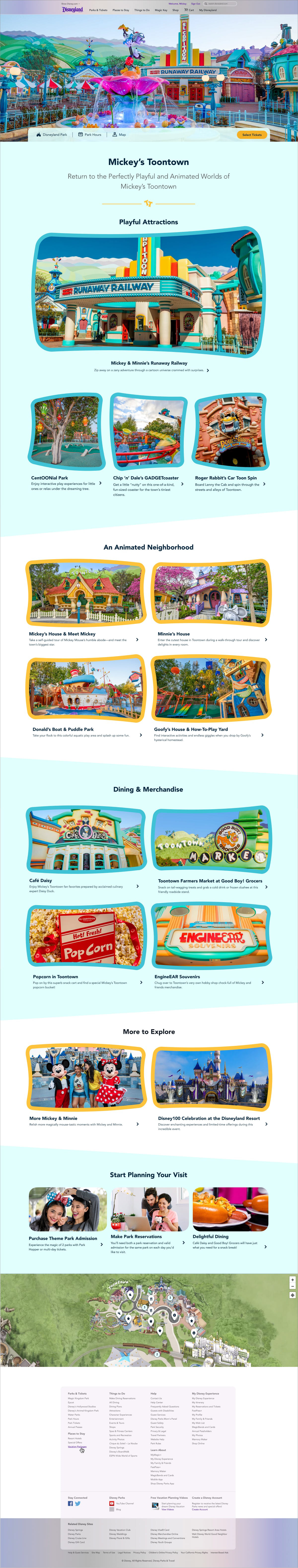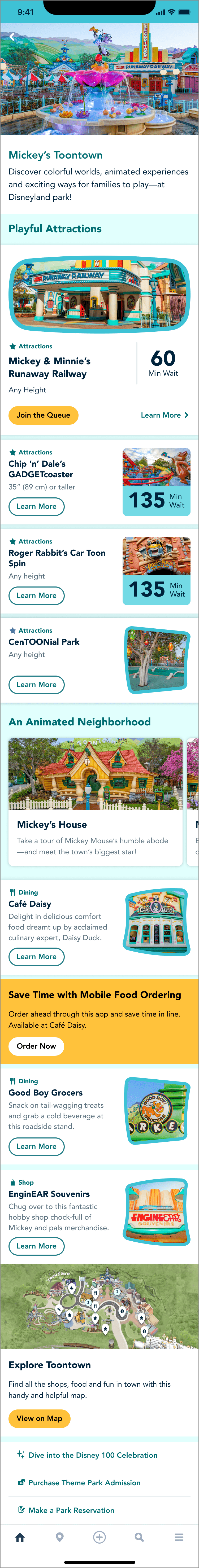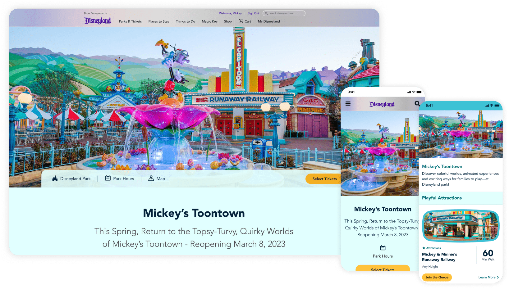
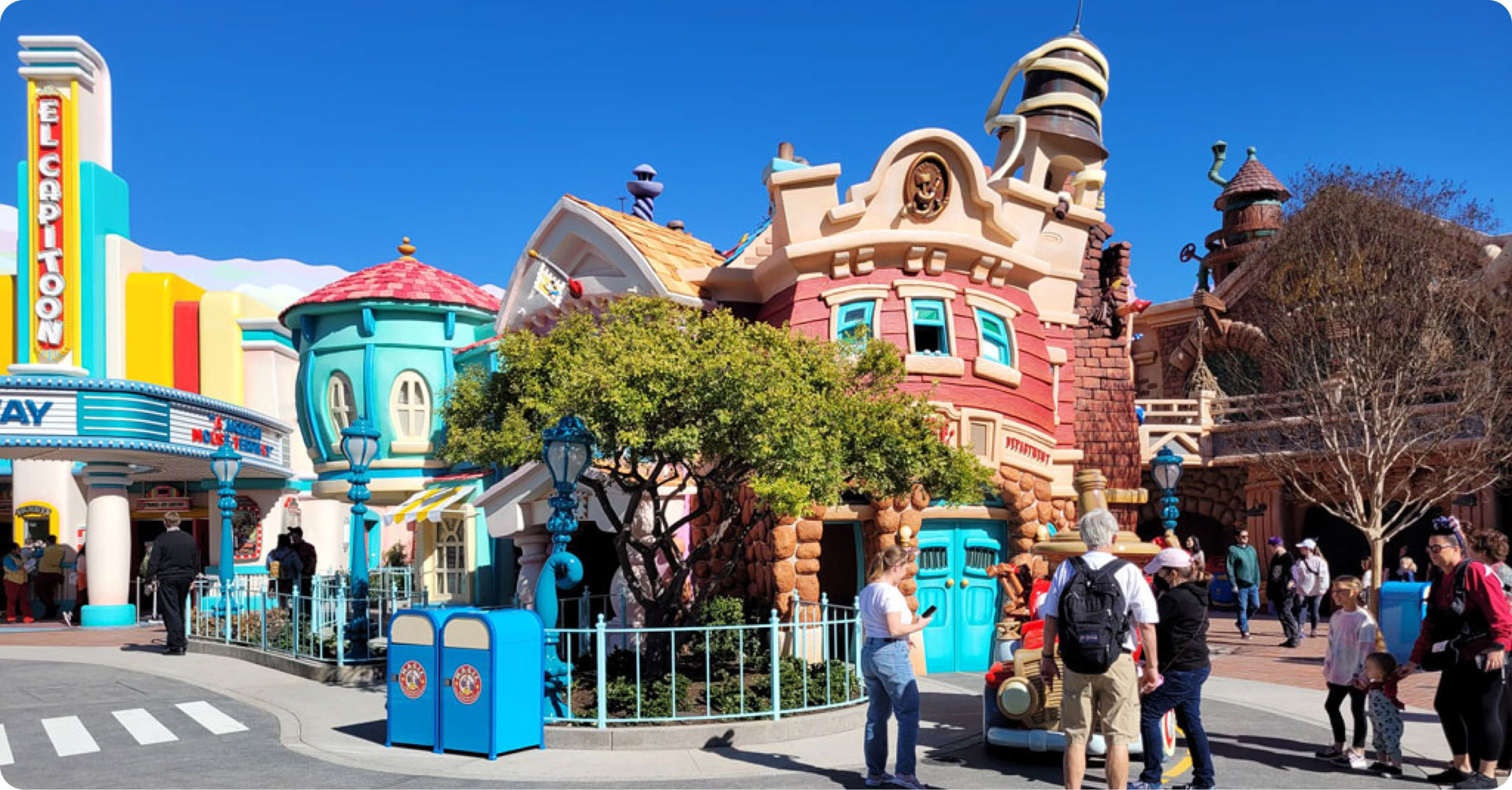
Toontown is an area of Disneyland Park where guests can step into a real-life cartoon land. When Toontown reopened after a brief closure, Disneyland marketing partners wanted new digital products to encourage visitors and promote the refreshed space.
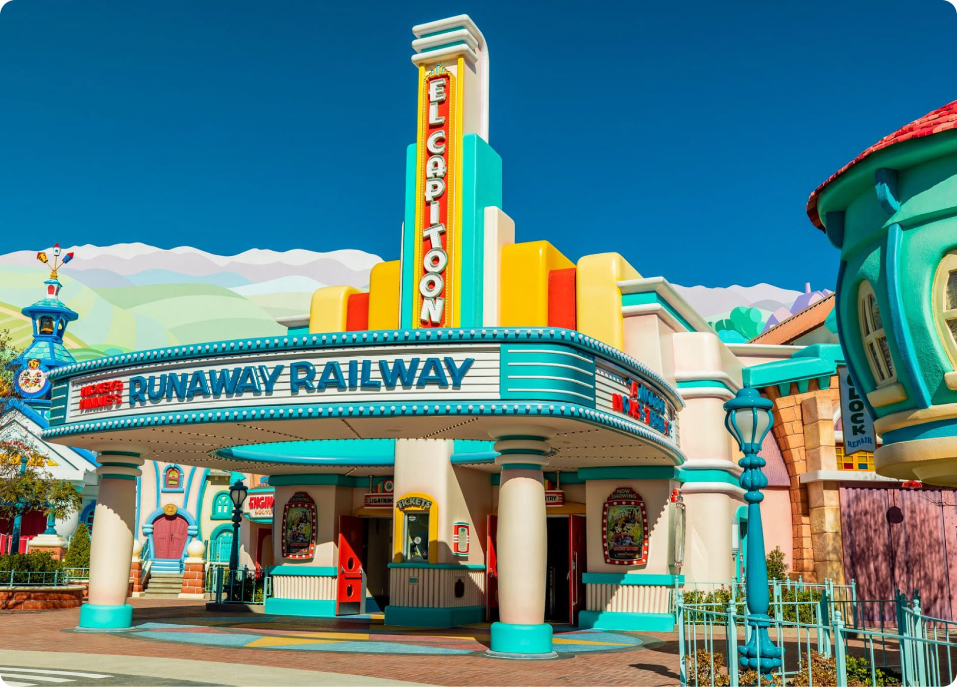
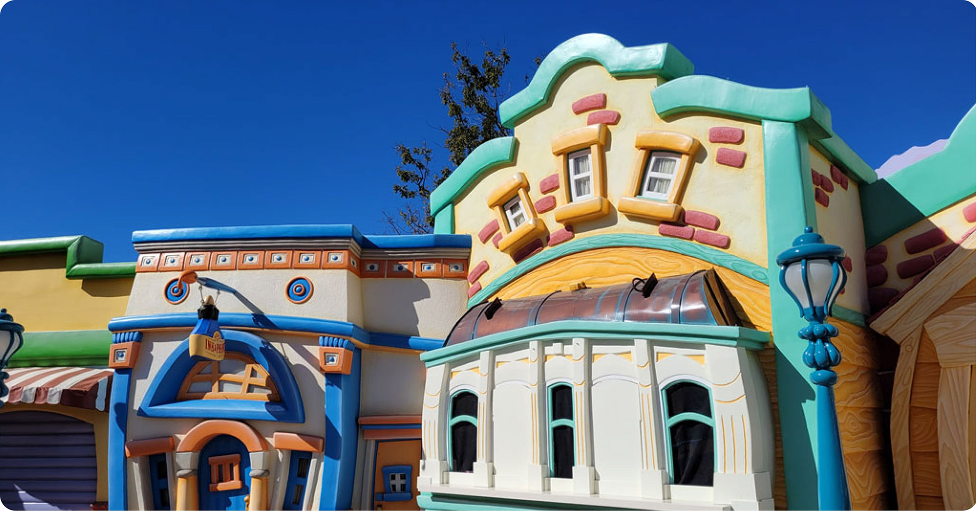
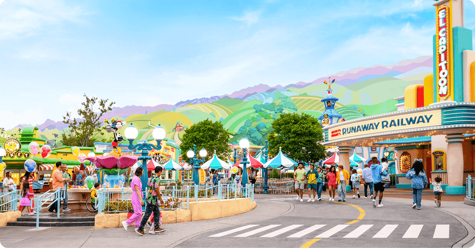
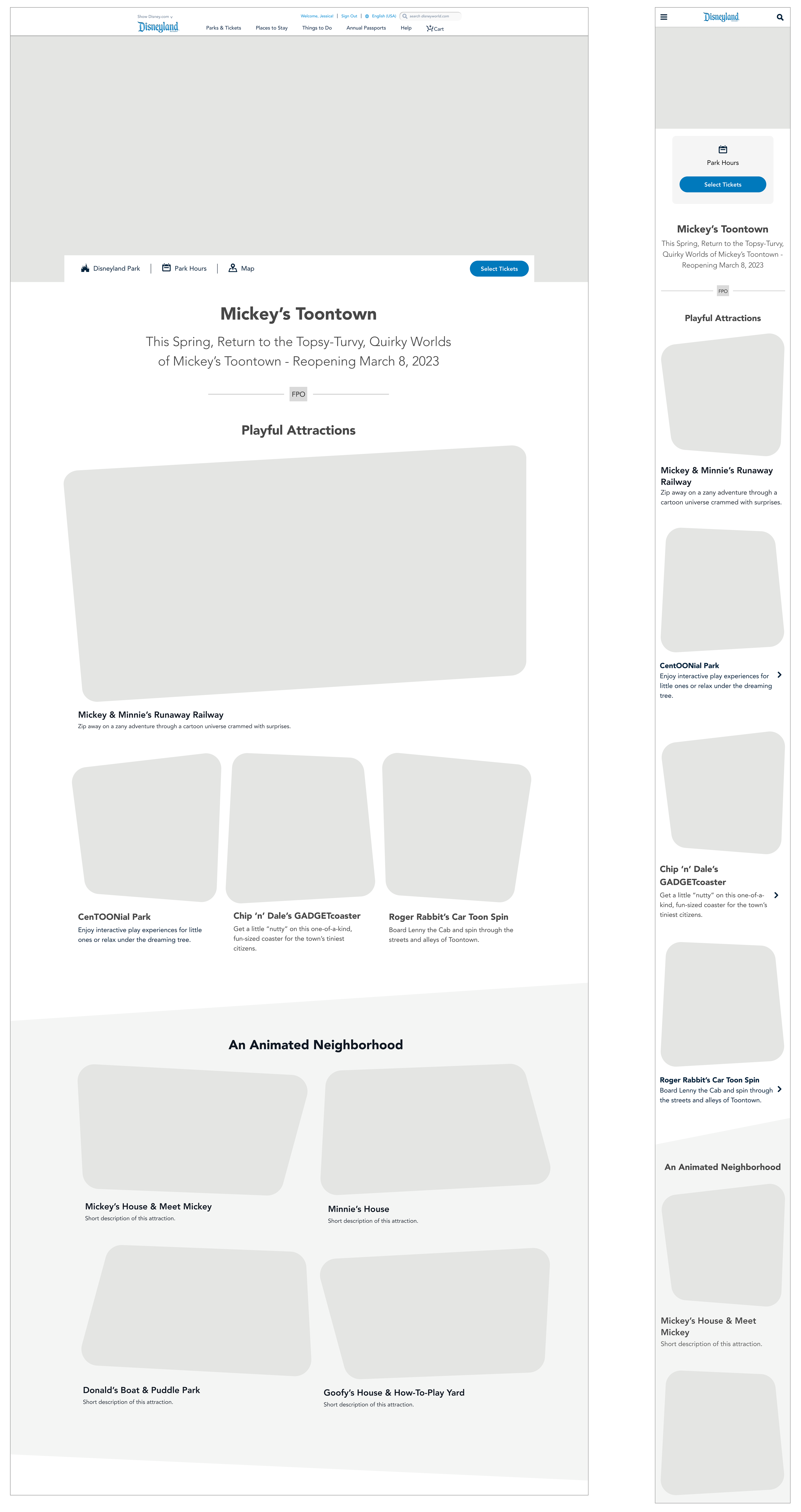
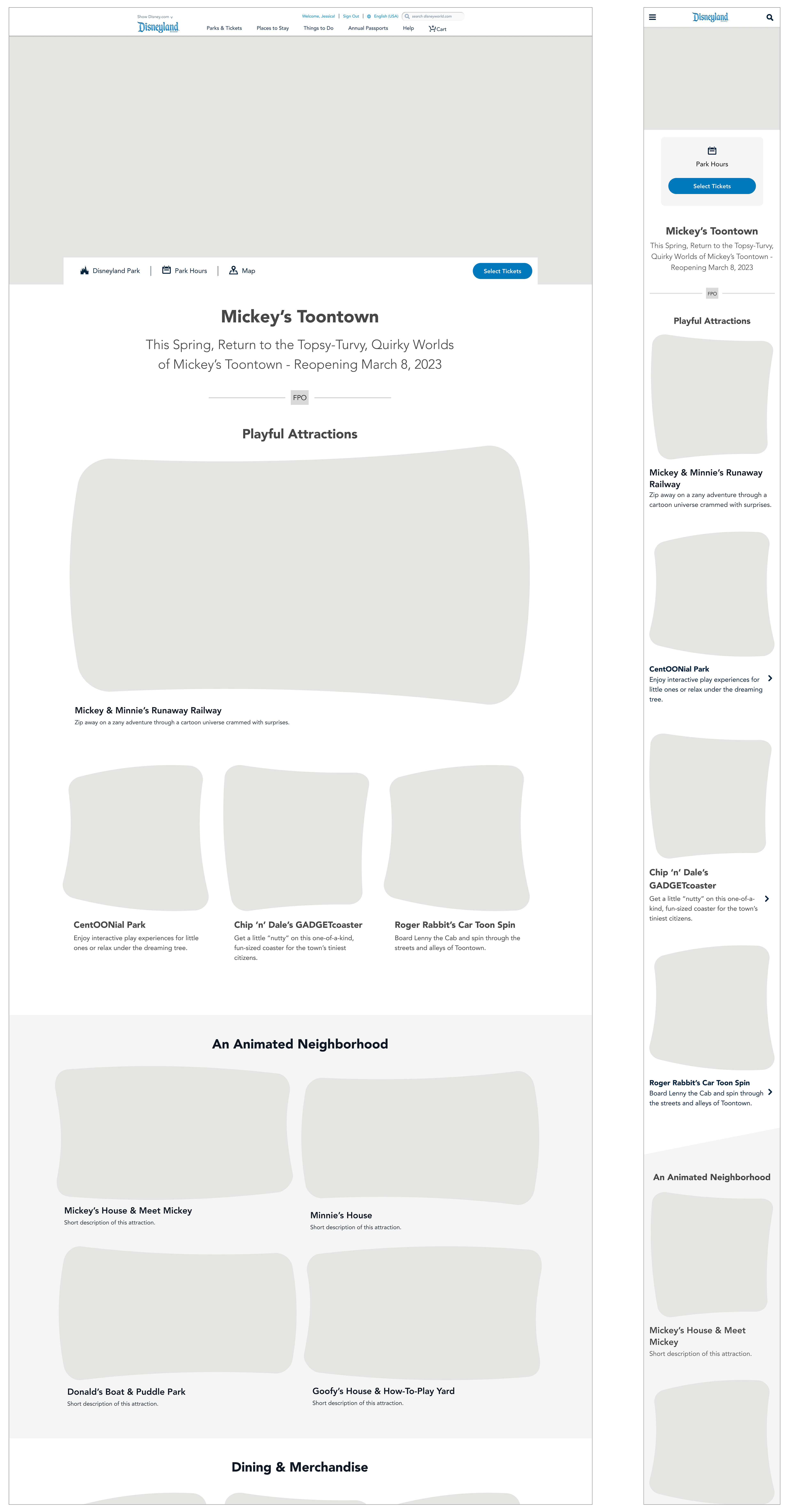
My job was to figure out how to translate the organized chaos of a cartoon land into a series of 13 web pages and an app screen. The designs had to be playful while still maintaining clarity of information. There was limited branding information available at this time so I also established a style guide for these products. I referenced Disney’s design system as well as photos and renderings of the space as inspiration.

Research & Inspiration

Wireframing
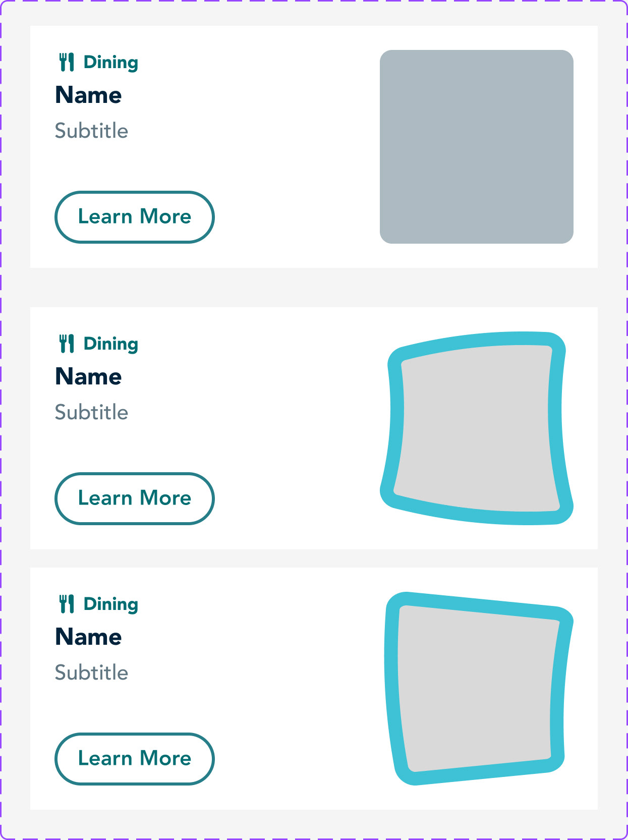
The squashed and stretched shapes from the land's architecture directly inspired the page layout.

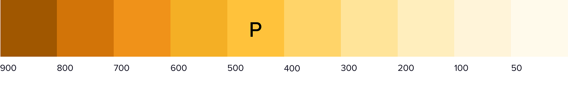
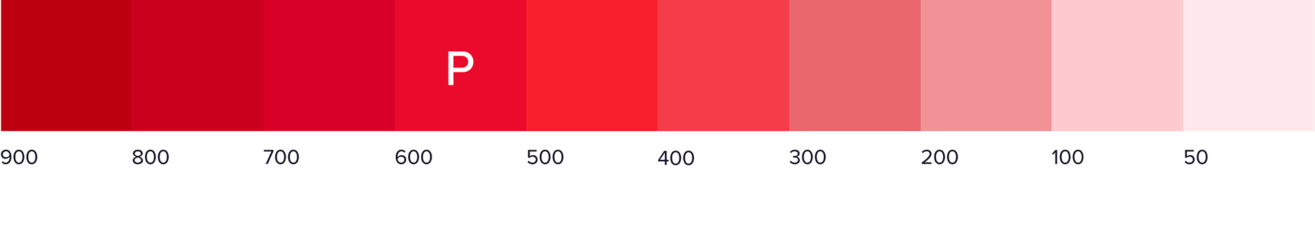
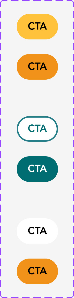
Color Selection
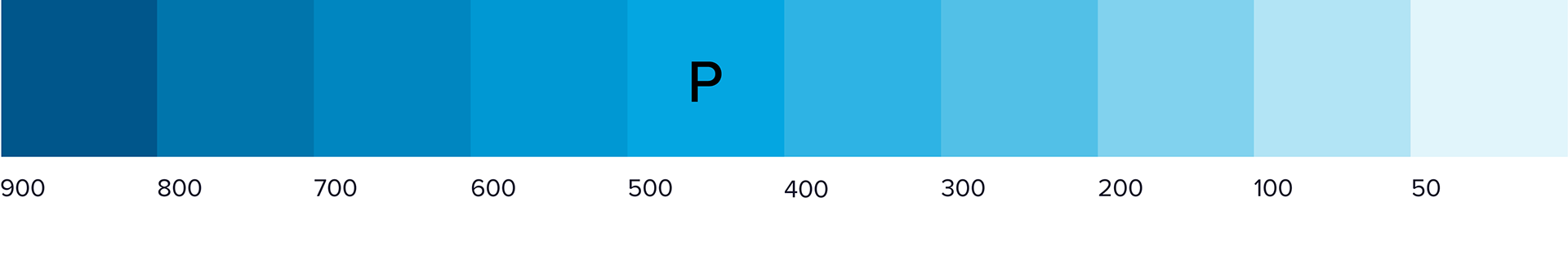
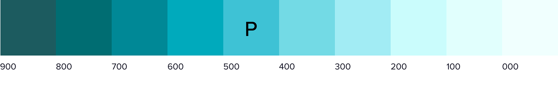

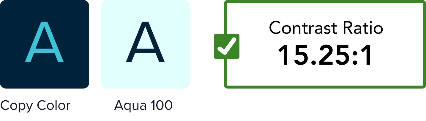
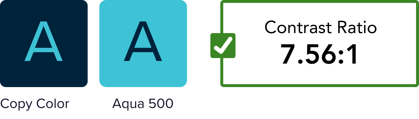
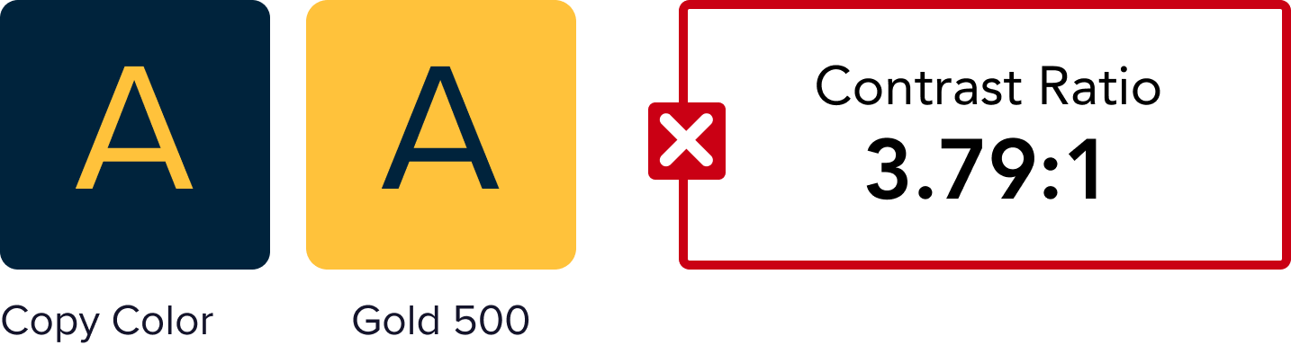
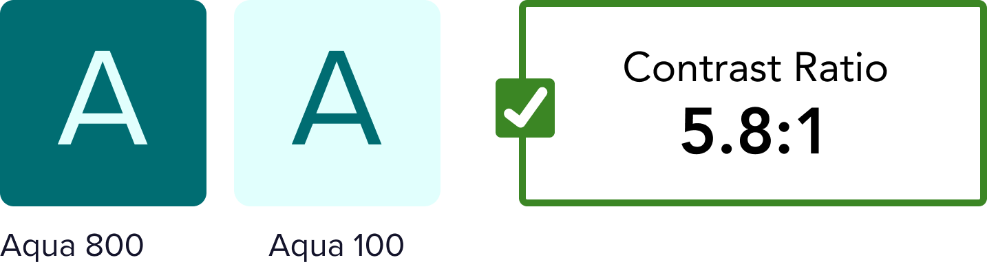
Accessibility Testing

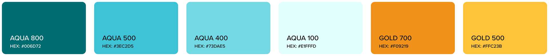
Final Color Palette


Design Elements
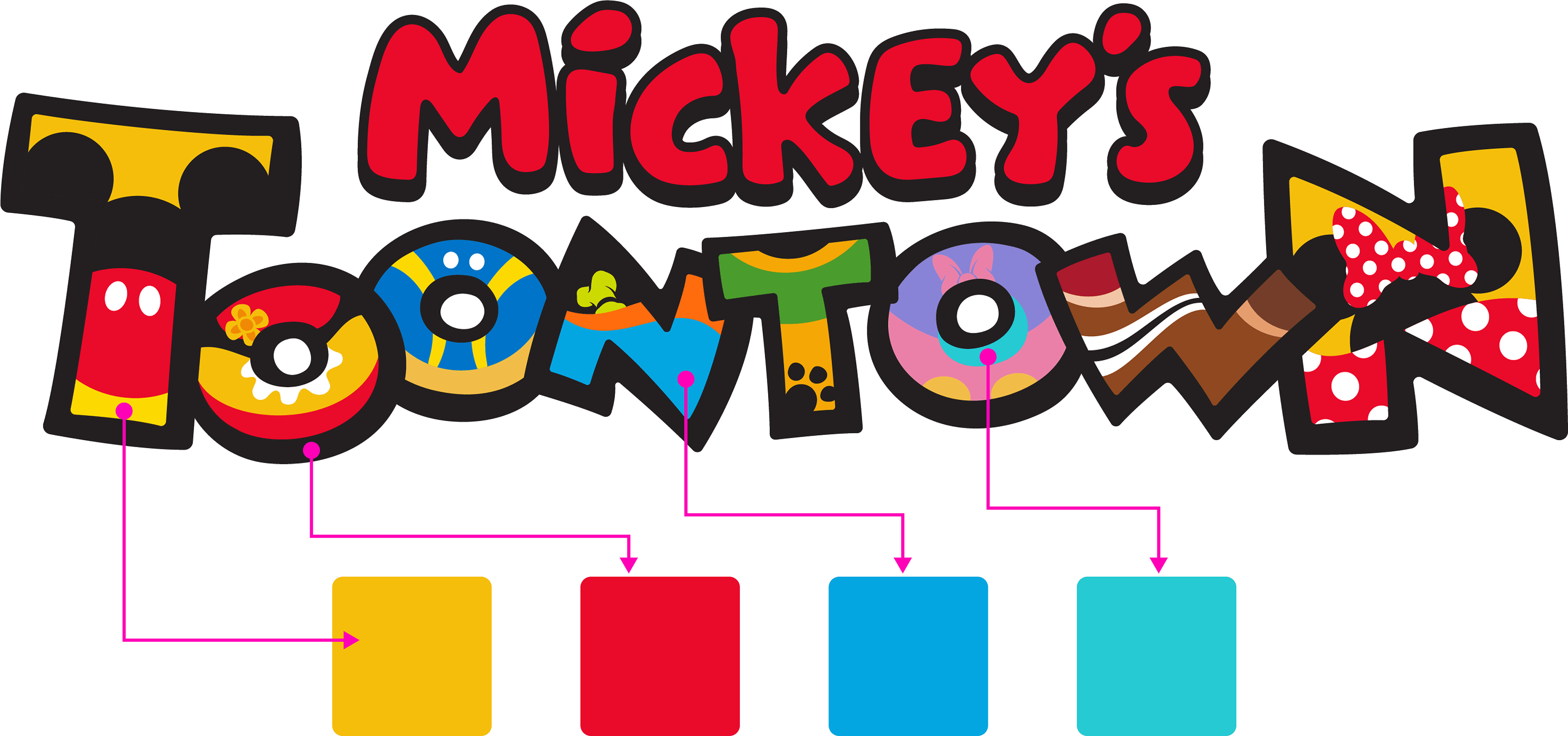
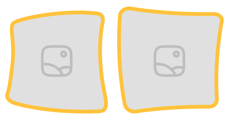
The design needed a touch of organized chaos. The architecture of Toontown inspired these squashed and stretched shapes that would be used to frame imagery.
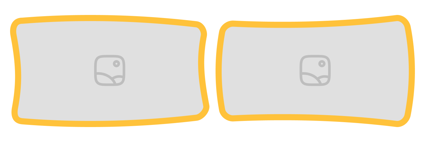
Desktop image frames: 20px, GOLD 500
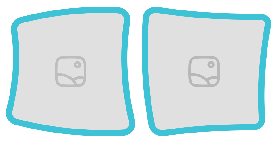
Desktop image frames: 20px, AQUA 500
Mobile image frames: 12px, GOLD 500

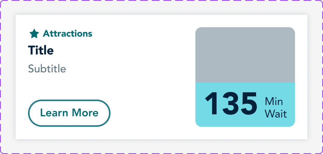
Final Designs
You can view the web pages live on Disneyland’s website. The app screen is currently available within the Disneyland app.