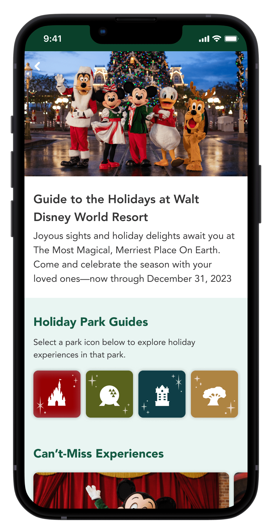
The Walt Disney World Guide to the Holidays is a series of app screens about all holiday events across the Florida parks and shopping areas. For this project, I created a cohesive visual system that unified 8 brands without sacrificing their individual identities.
I identified core colors and elements that worked with all brands and applied those to recurring components across the screens. This created the unity I was seeking but still let each brand's identity shine.
To skip to the process and go straight to the prototype, click here.

The Design Process

Walt Disney World Holiday Style Guide
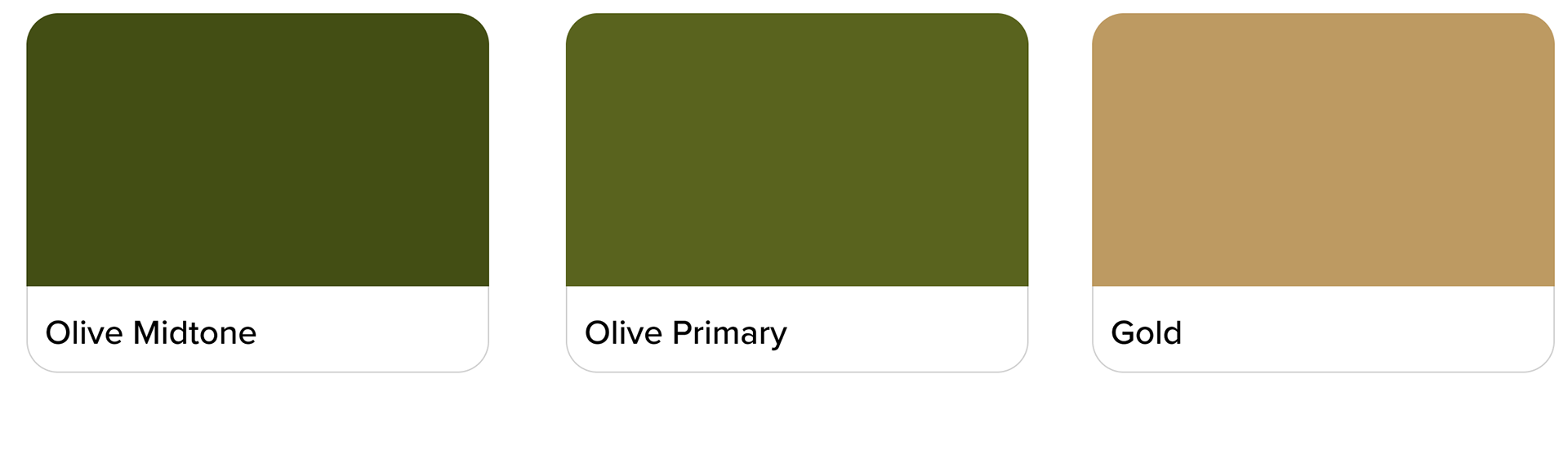
Core Brand Colors & Elements
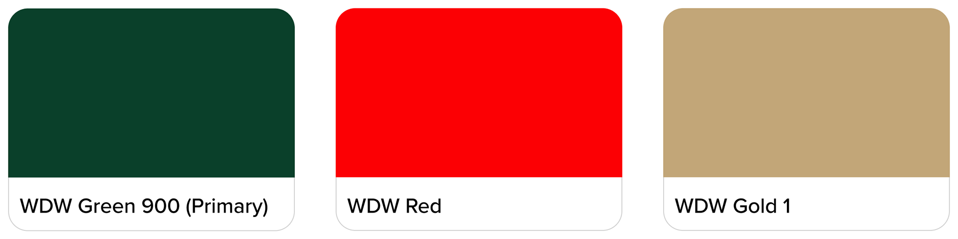
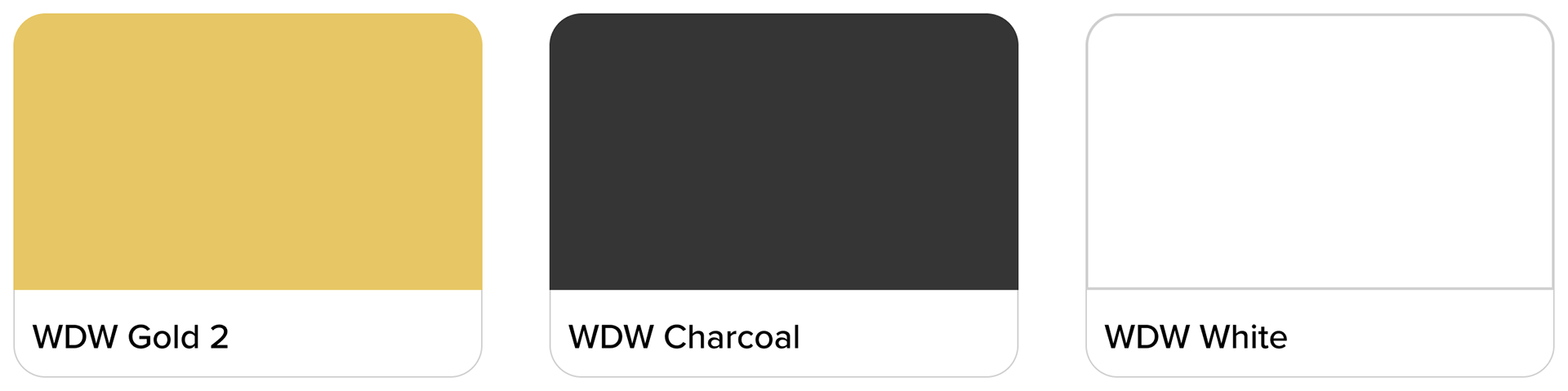
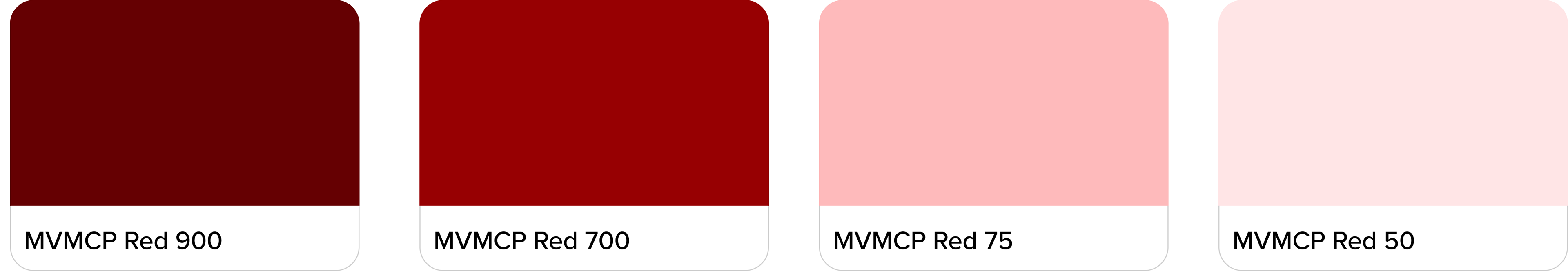
The overarching style guide for the holidays at Walt Disney World consisted of 6 colors, including green, red, and gold, as well as some embellishments. This guide was a starting point to inform the look and feel of the entire digital product.

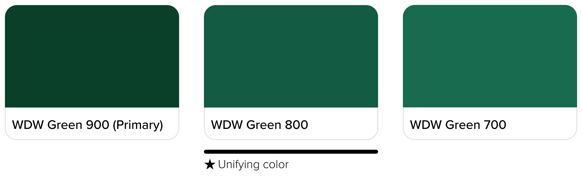
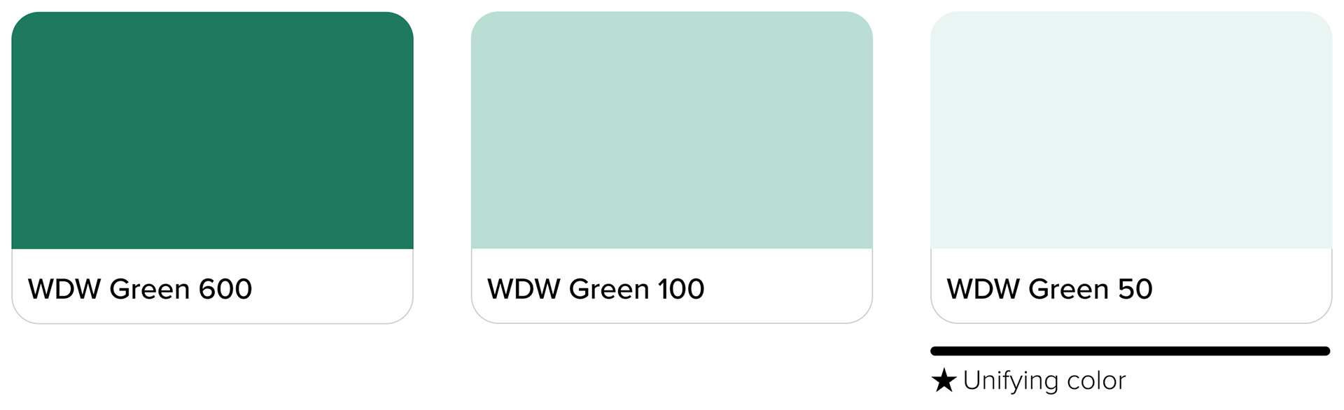
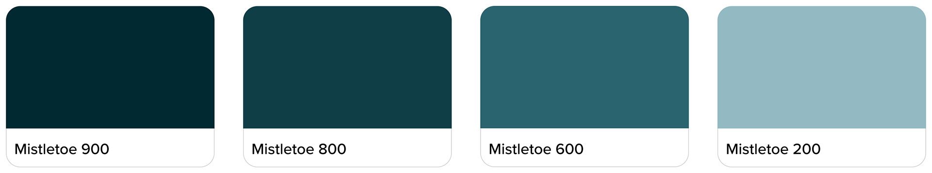
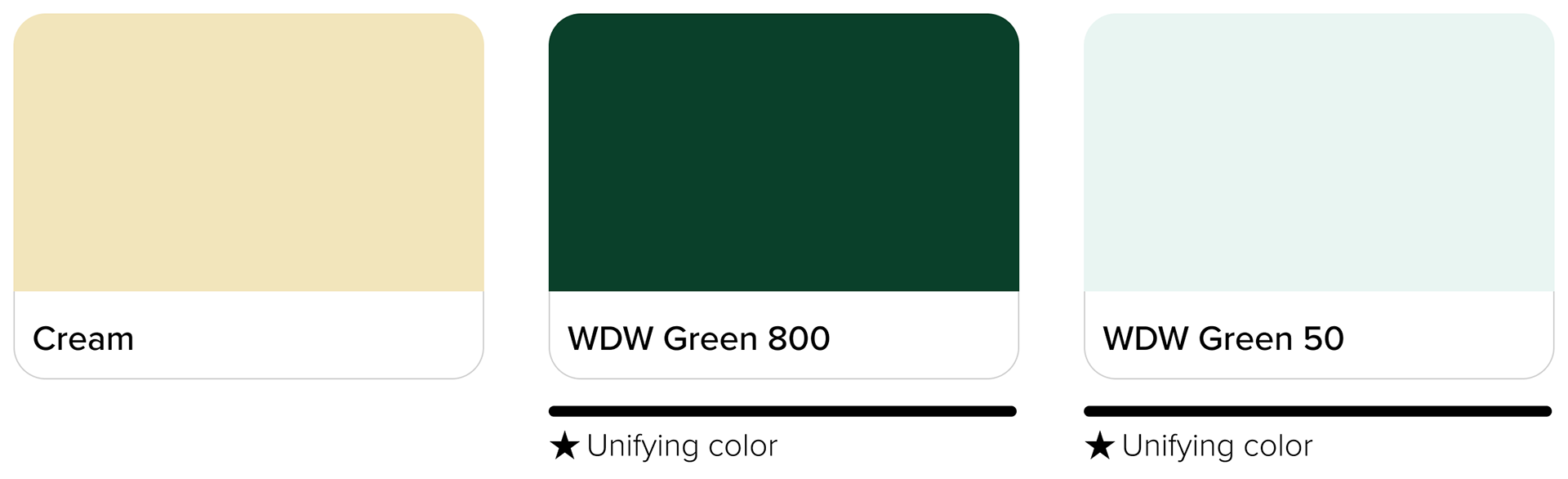
Tonal Explorations of Brand Green
I explored tonal variations of the brand green to see what other color options might be available for the guide screens. I found the green to be versatile, festive, and accessible. Green 800 and Green 50 became unifying colors throughout the entire guide. Below are some app components with the brand green applied.

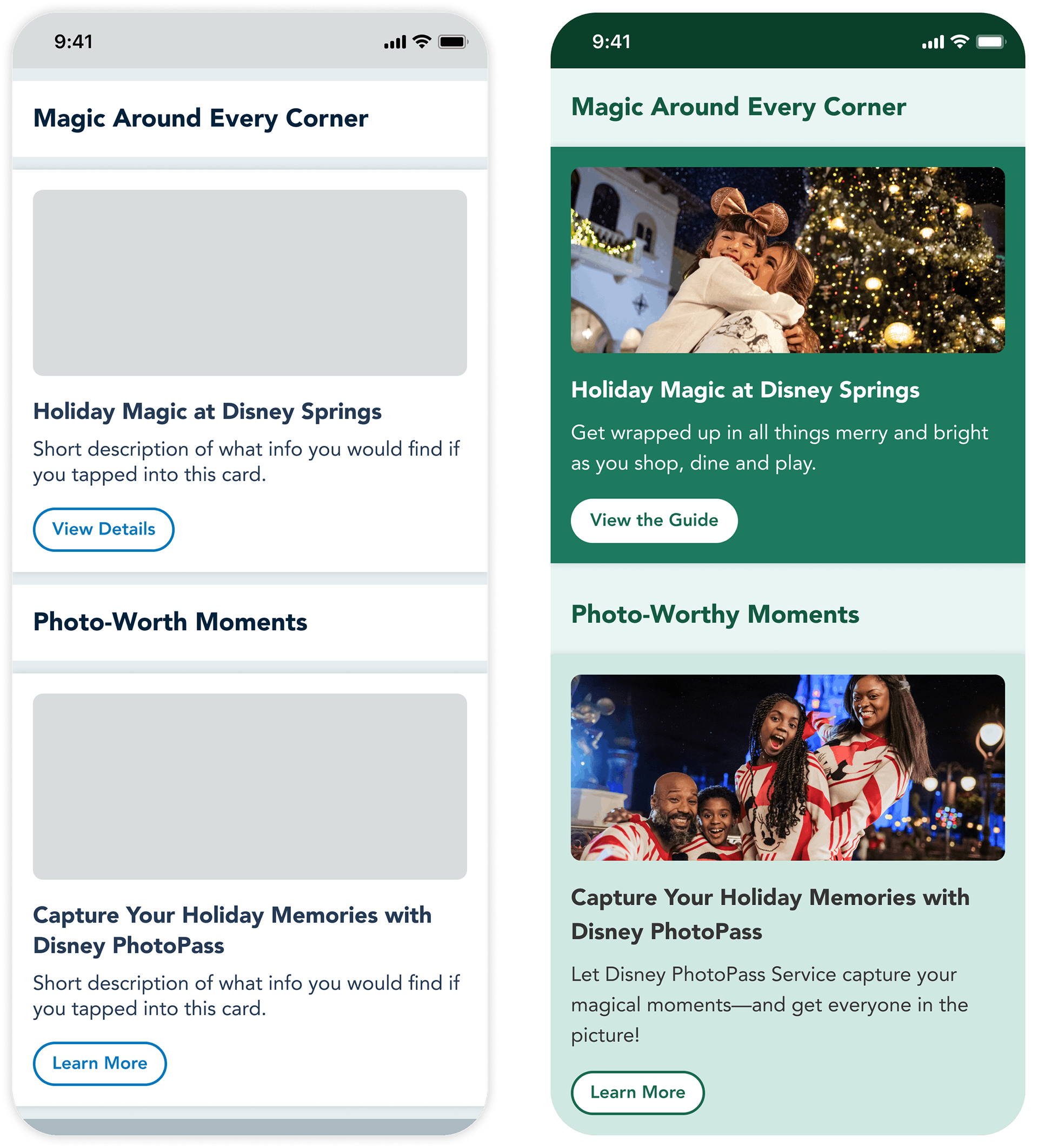
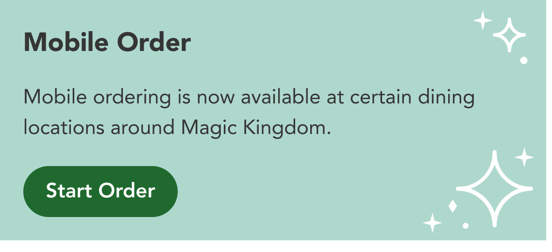
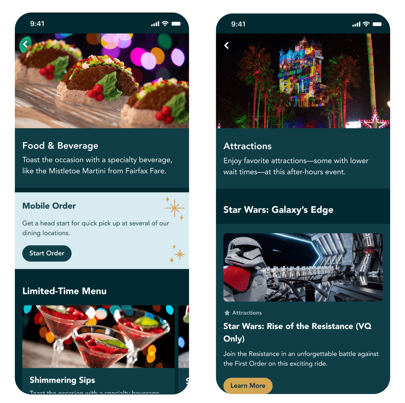
A section of the guide's home screen before and after branding is applied.
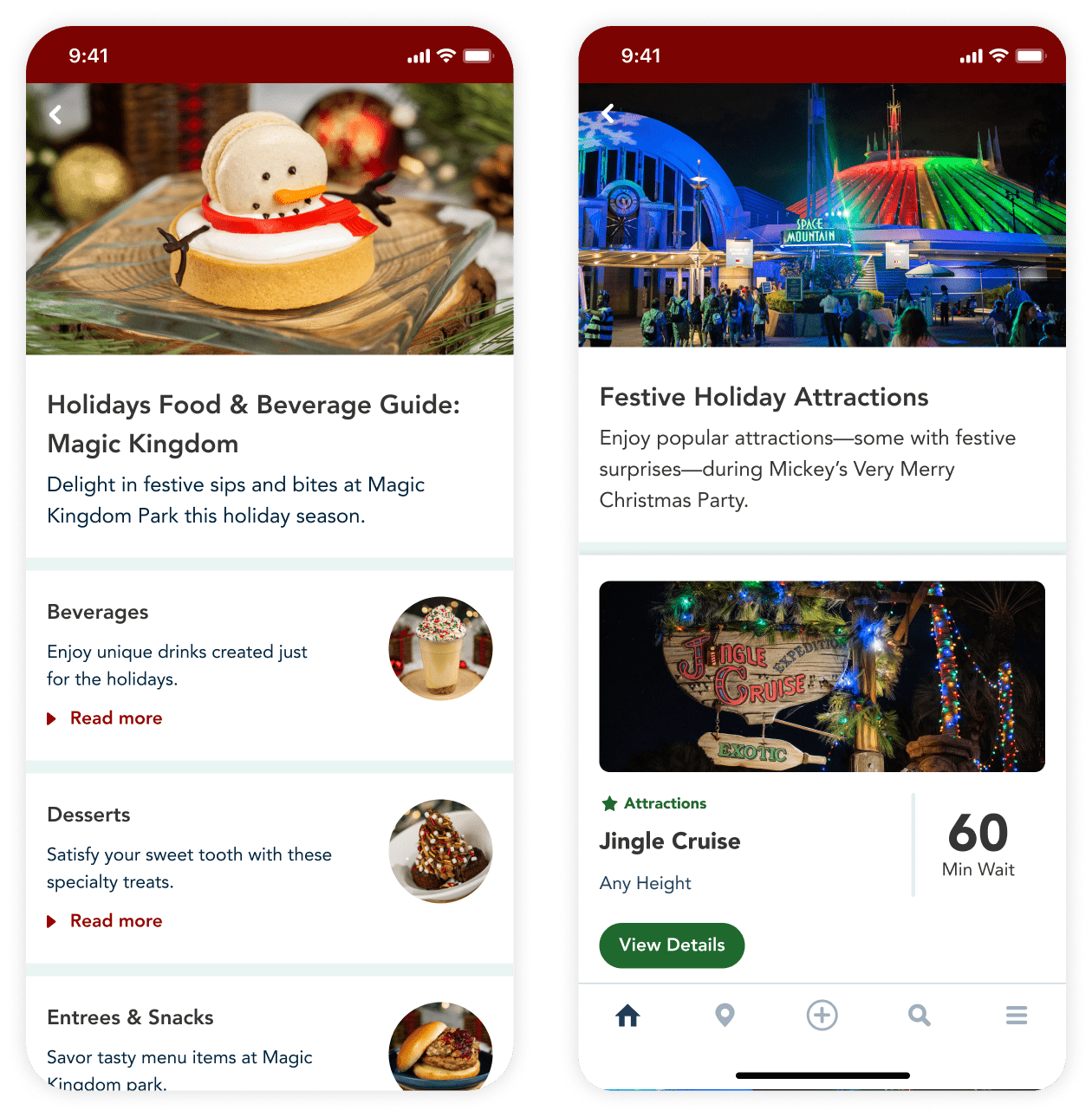
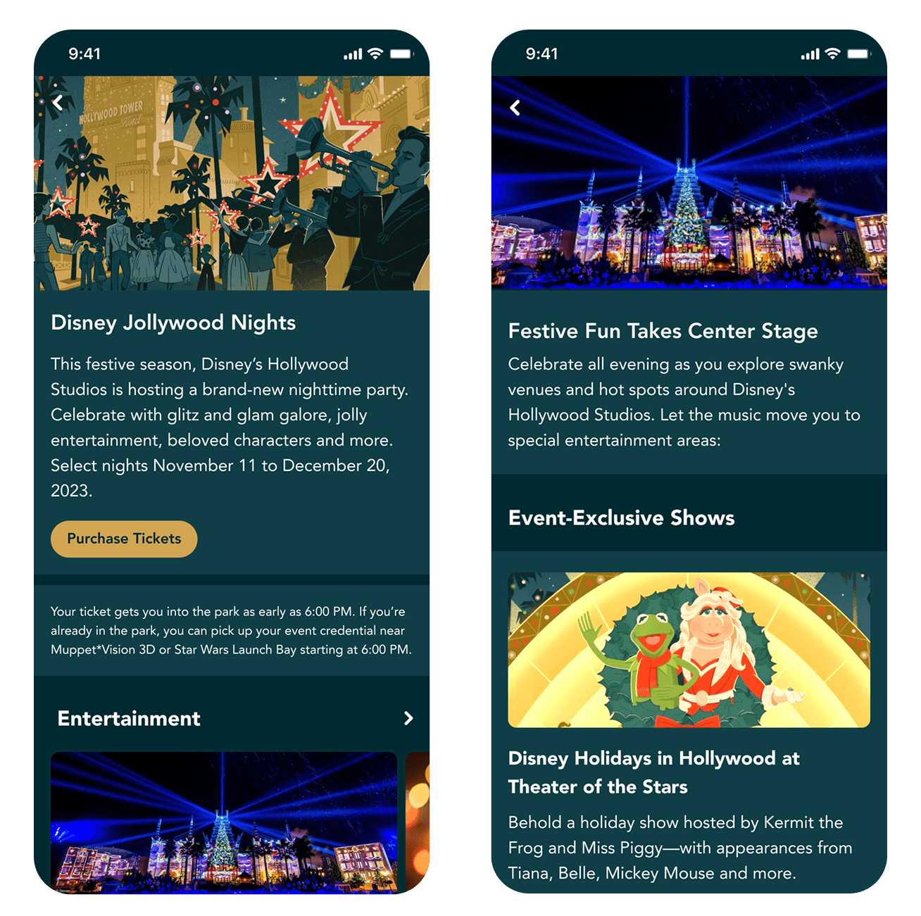
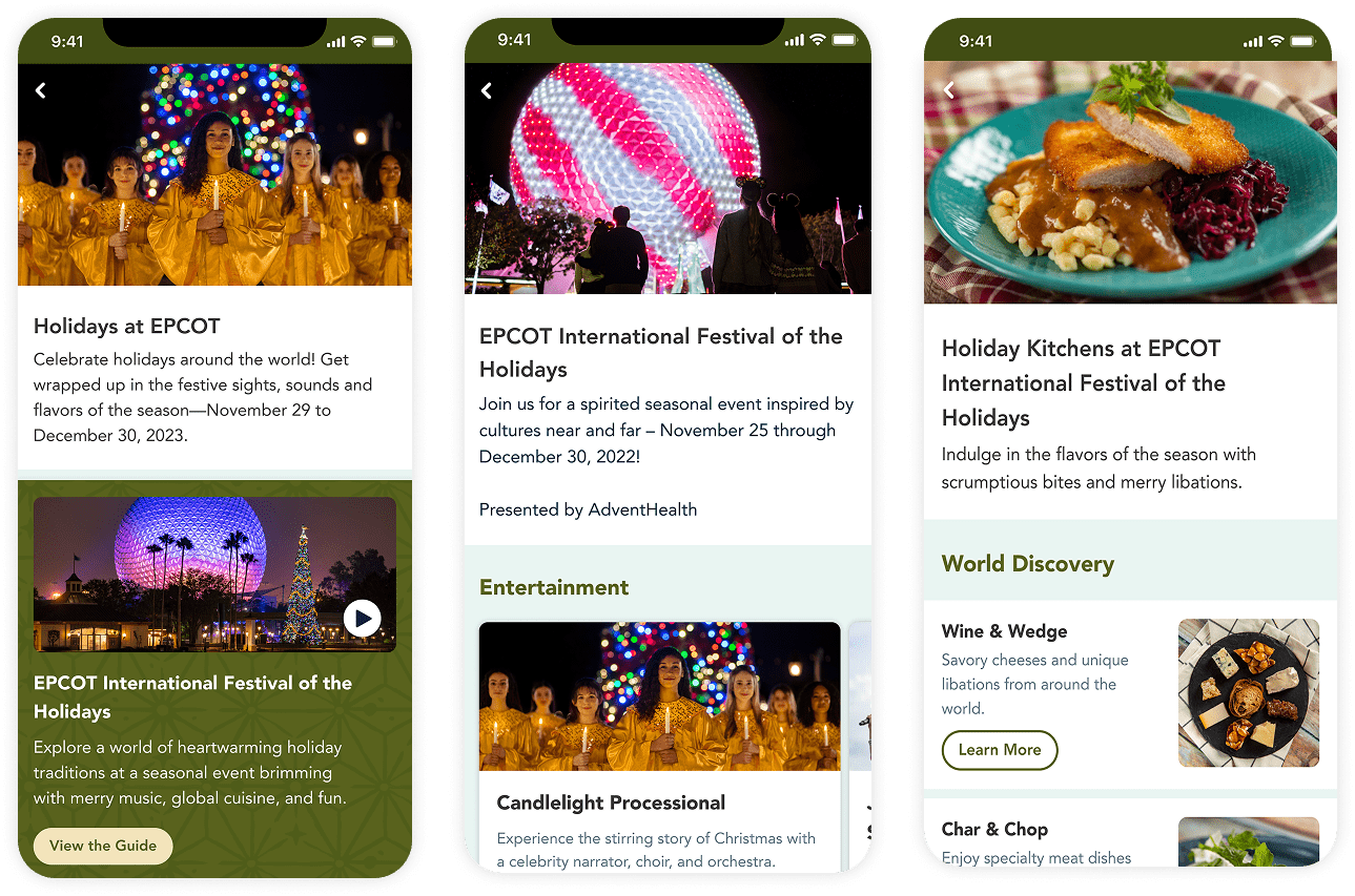
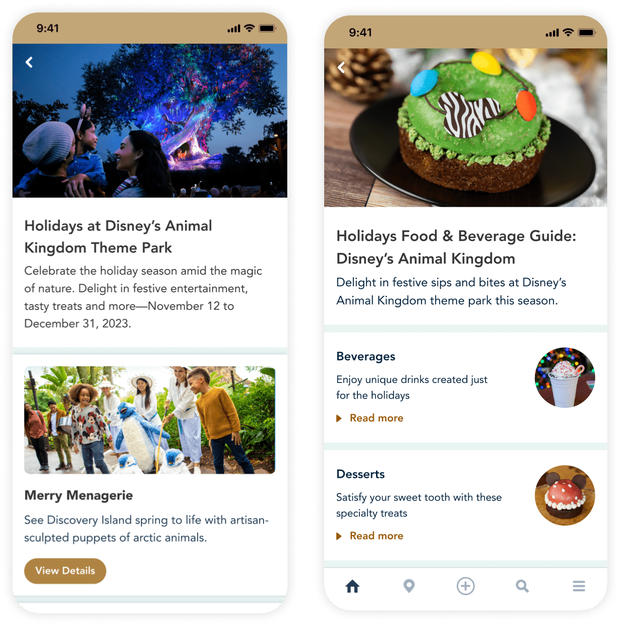
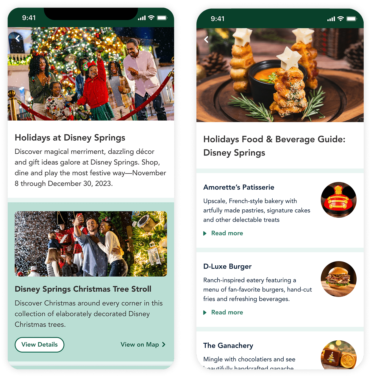
Maintaining Individuality
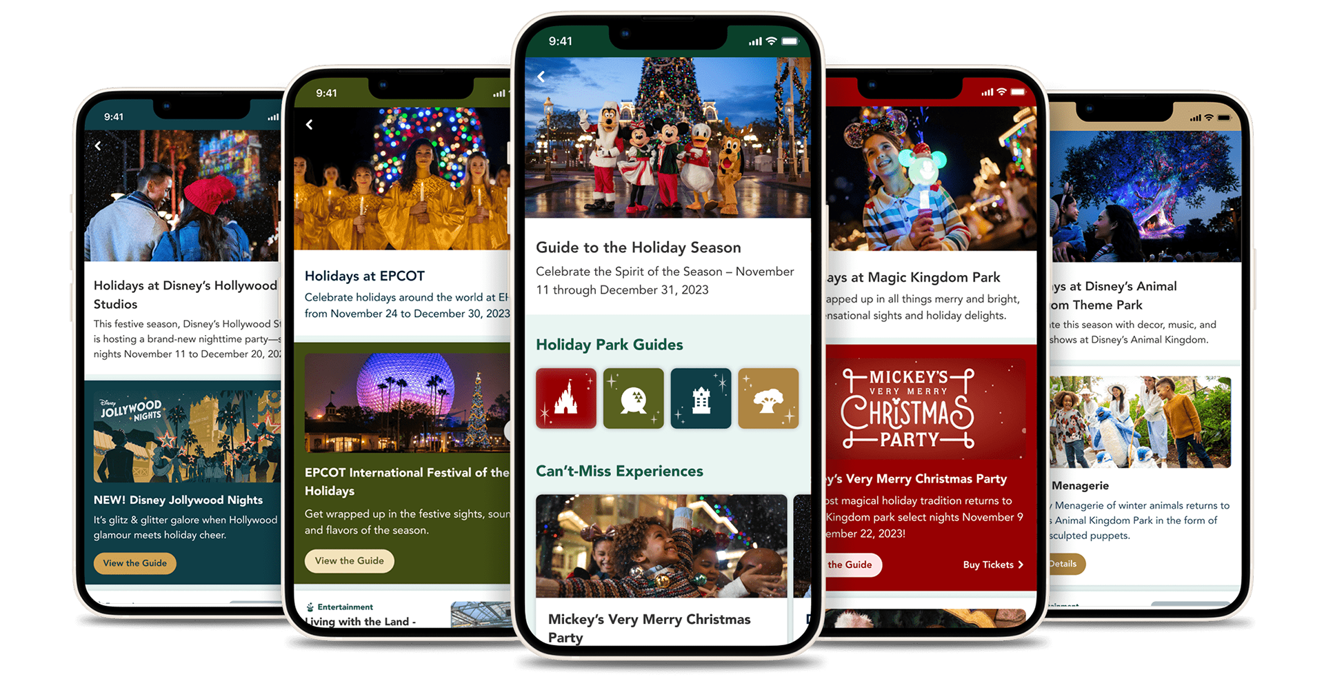
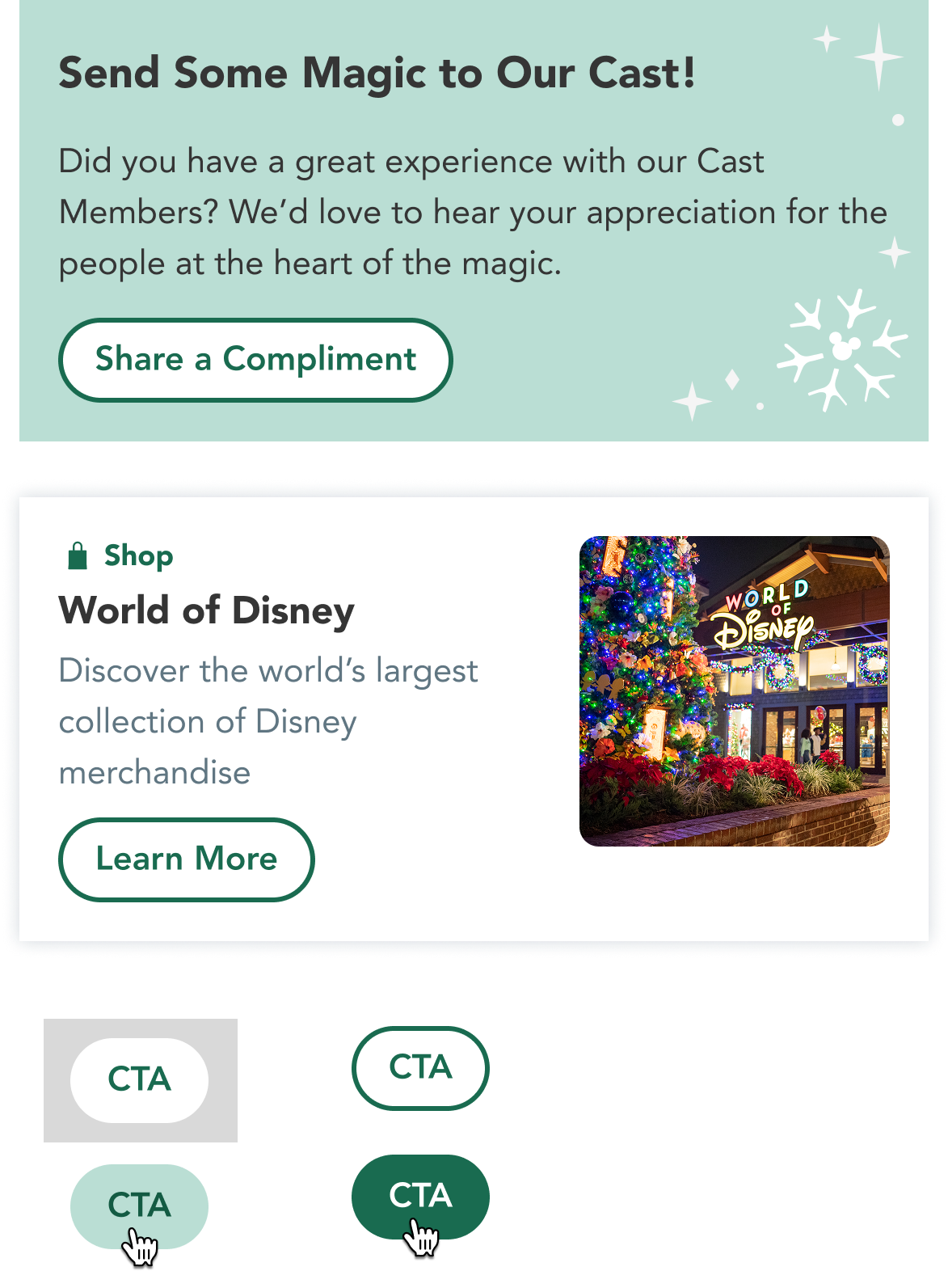
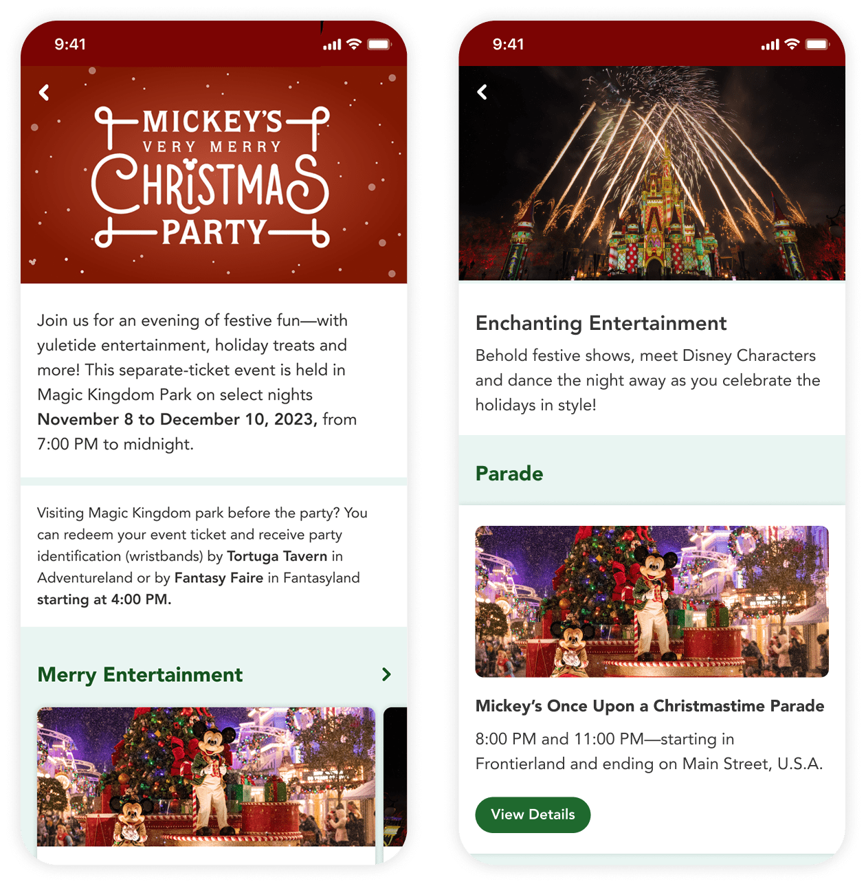
The visual identities for each park and event had to be distinct and on brand and also work well with the common core colors. For the screens below, I adapted and applied each individual style guide and applied the core colors to recurring components for unity.


Icon Design


Putting it All Together
Click below to view a prototype of the final product.