


Project Overview
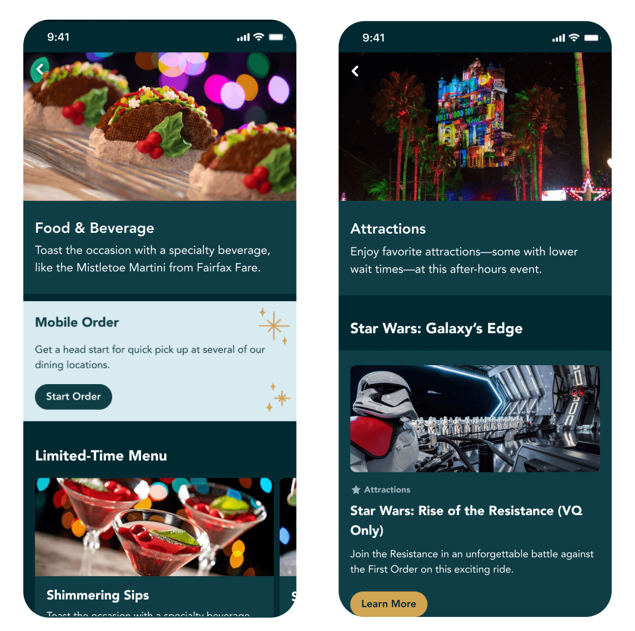
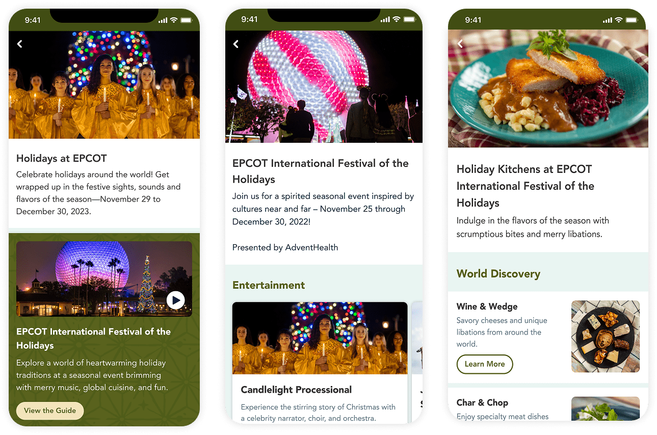
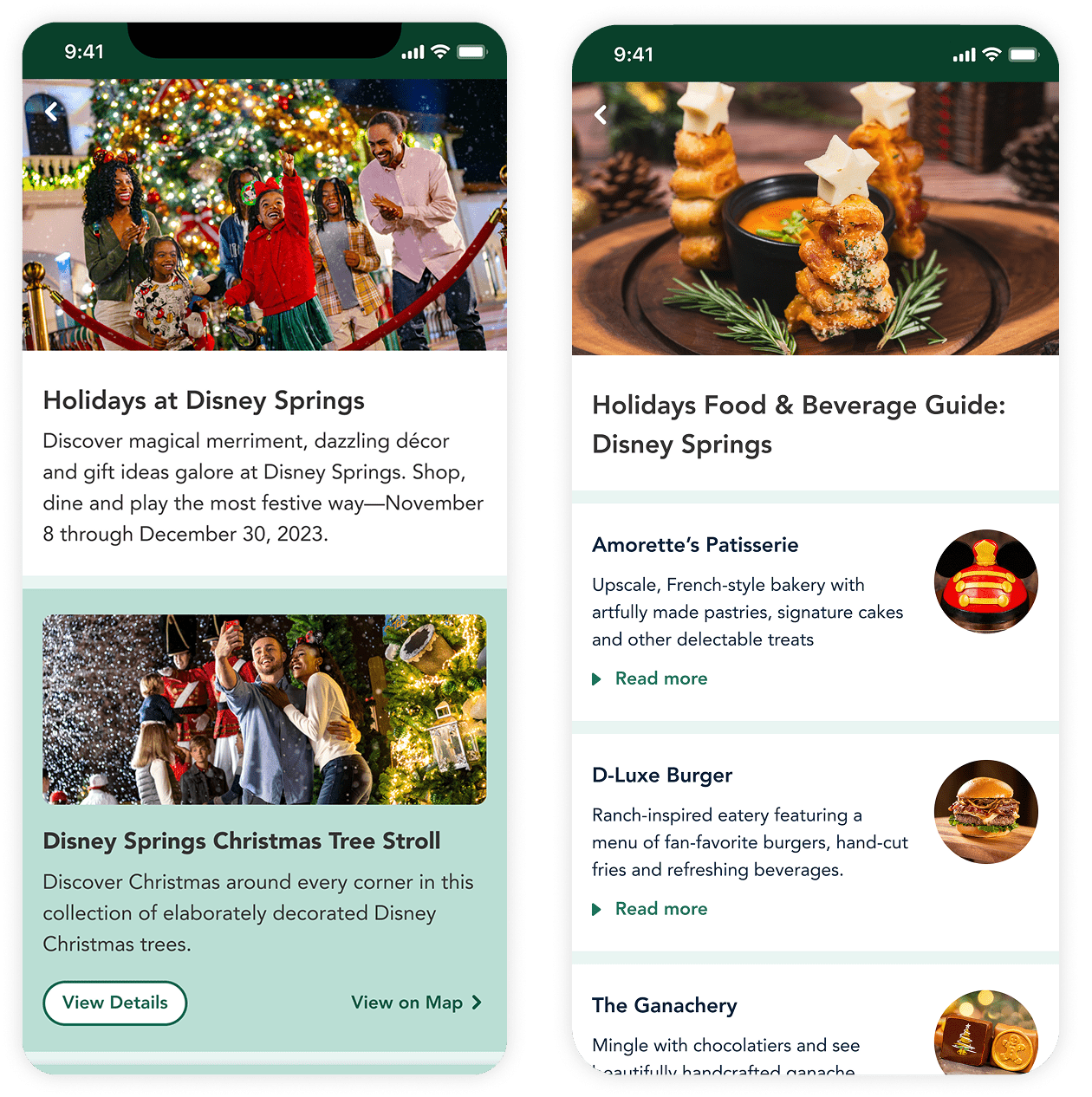
This project involved designing a set of consumer-facing screens which contained all details about the 2023 holiday events across Walt Disney World Resort. It also enabled ticket purchases as well as ordering and paying for food.
Problem & Solution
As visual designer, I had to figure out how to unify eight distinct brands within one product while also maintaining each brand's unique identity.
I solved this by finding foundations of the color system that were harmonious with all brands and applied those core colors to consistent elements across all screens. This created visual unity while still letting the individual brands stand out.
I solved this by finding foundations of the color system that were harmonious with all brands and applied those core colors to consistent elements across all screens. This created visual unity while still letting the individual brands stand out.
Roles & Skills

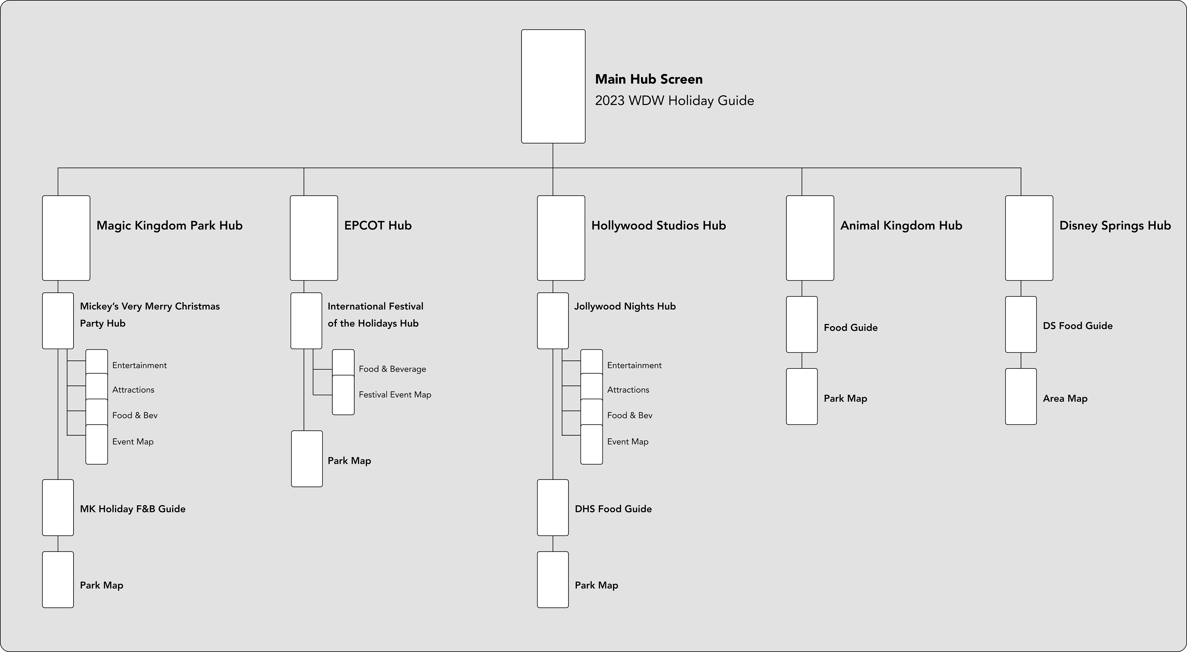
Sitemap & Scope
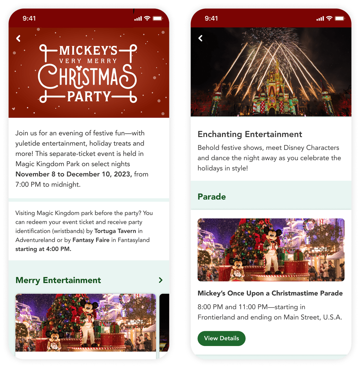
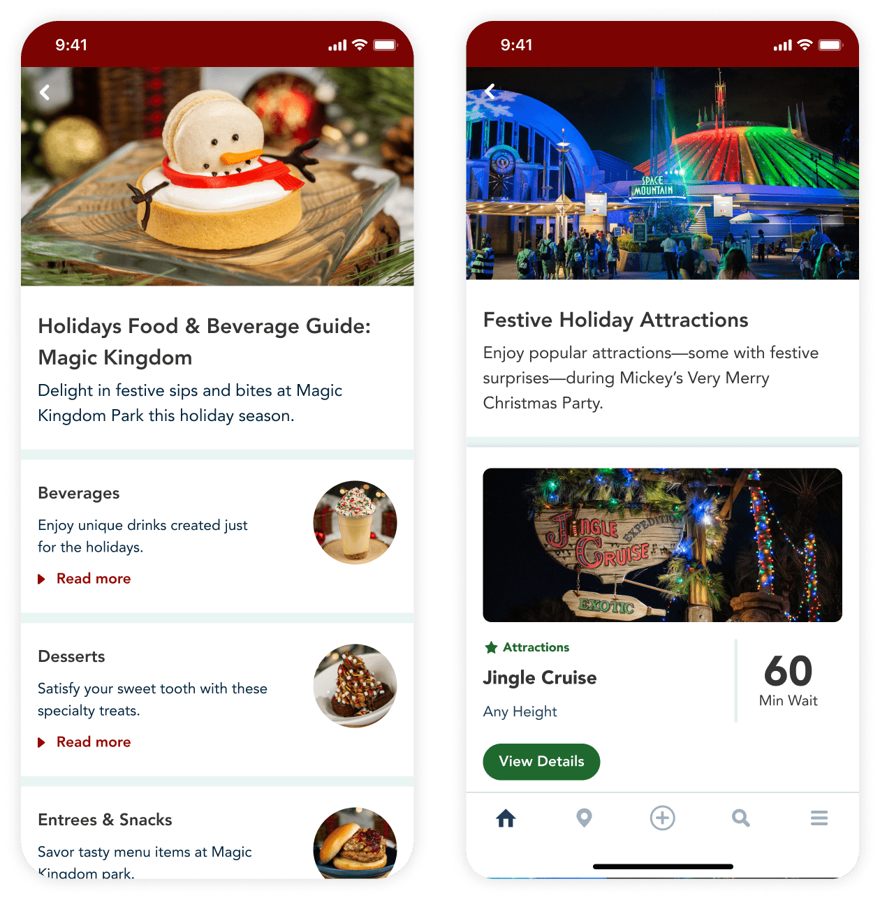
The guide used a hub and spoke navigation model. It included all four theme parks, the Disney Springs shopping and entertainment district, and three seasonal special events.

Creating Consistency

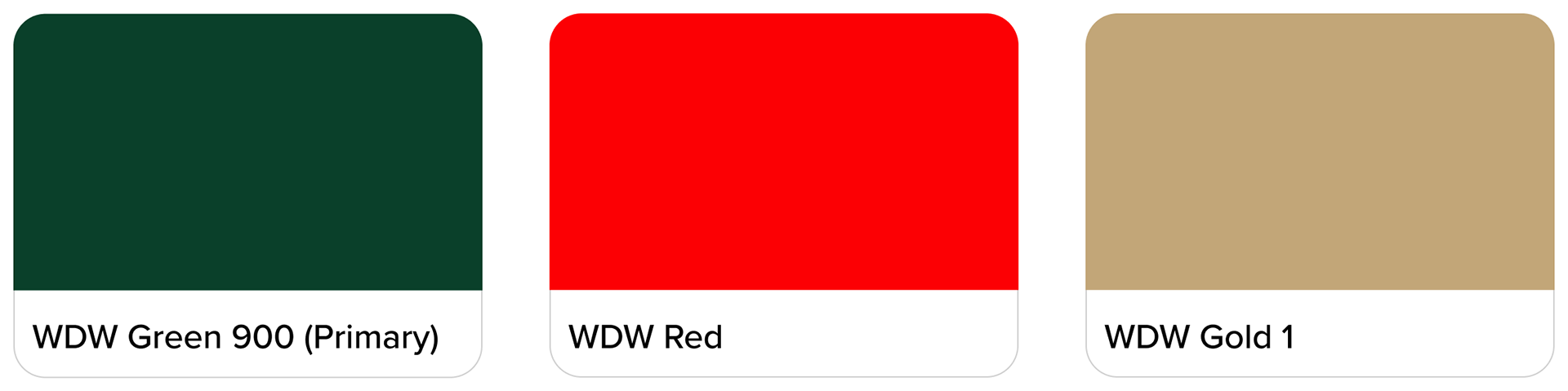
WDW Holiday Style Guide
Core Brand Colors

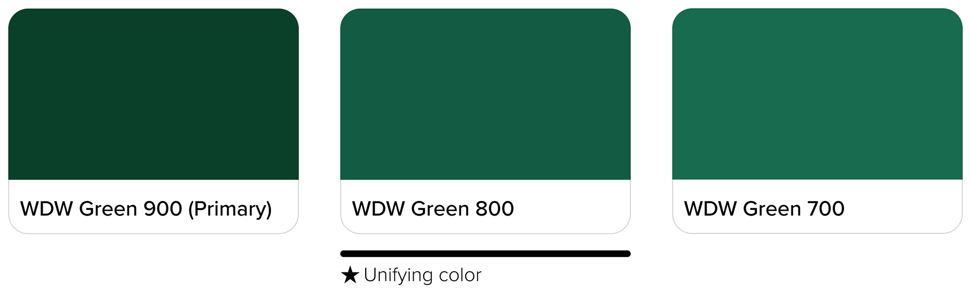
Adapting Colors for Digital Use
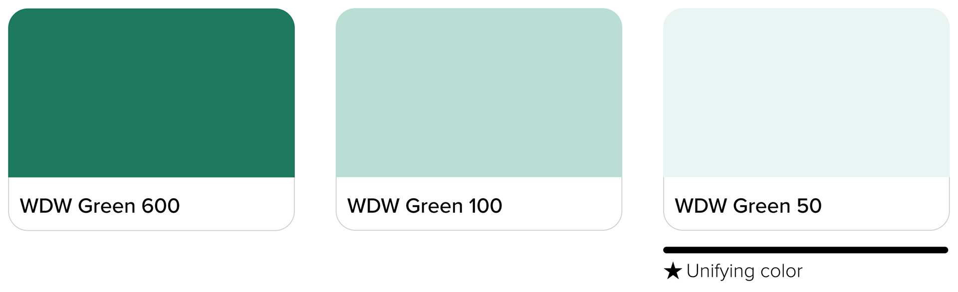
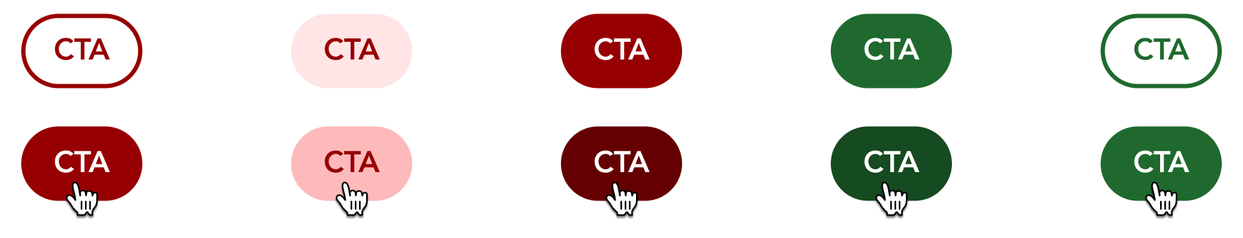
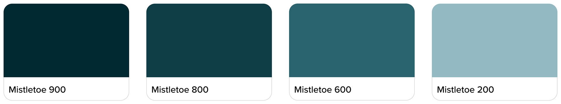
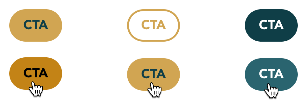
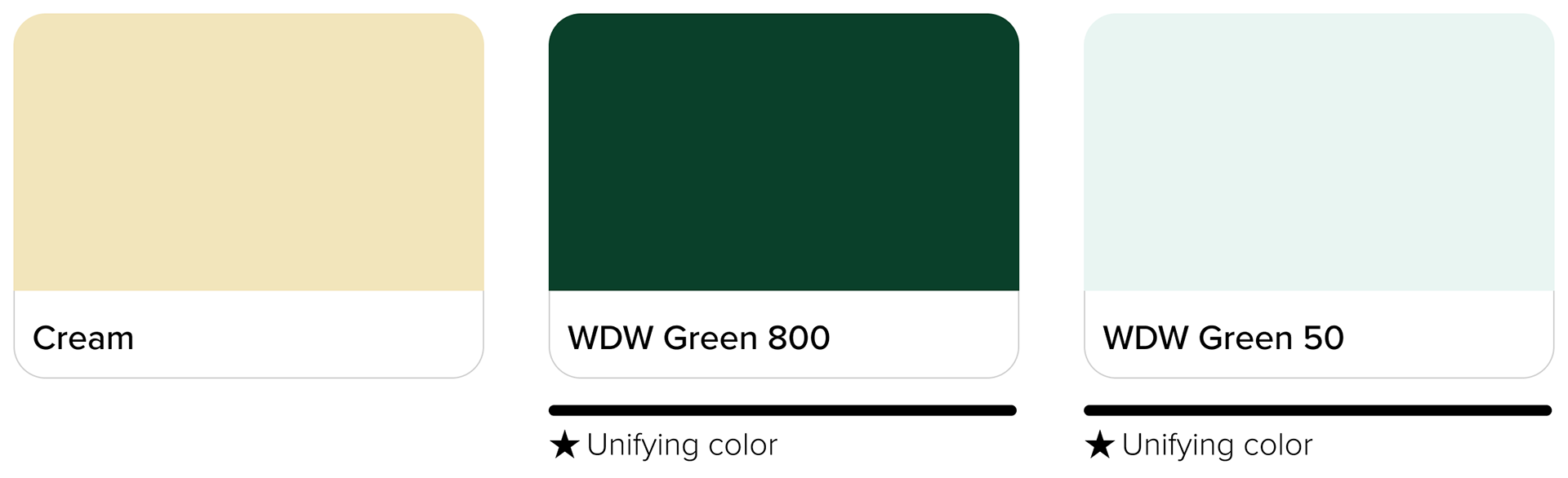
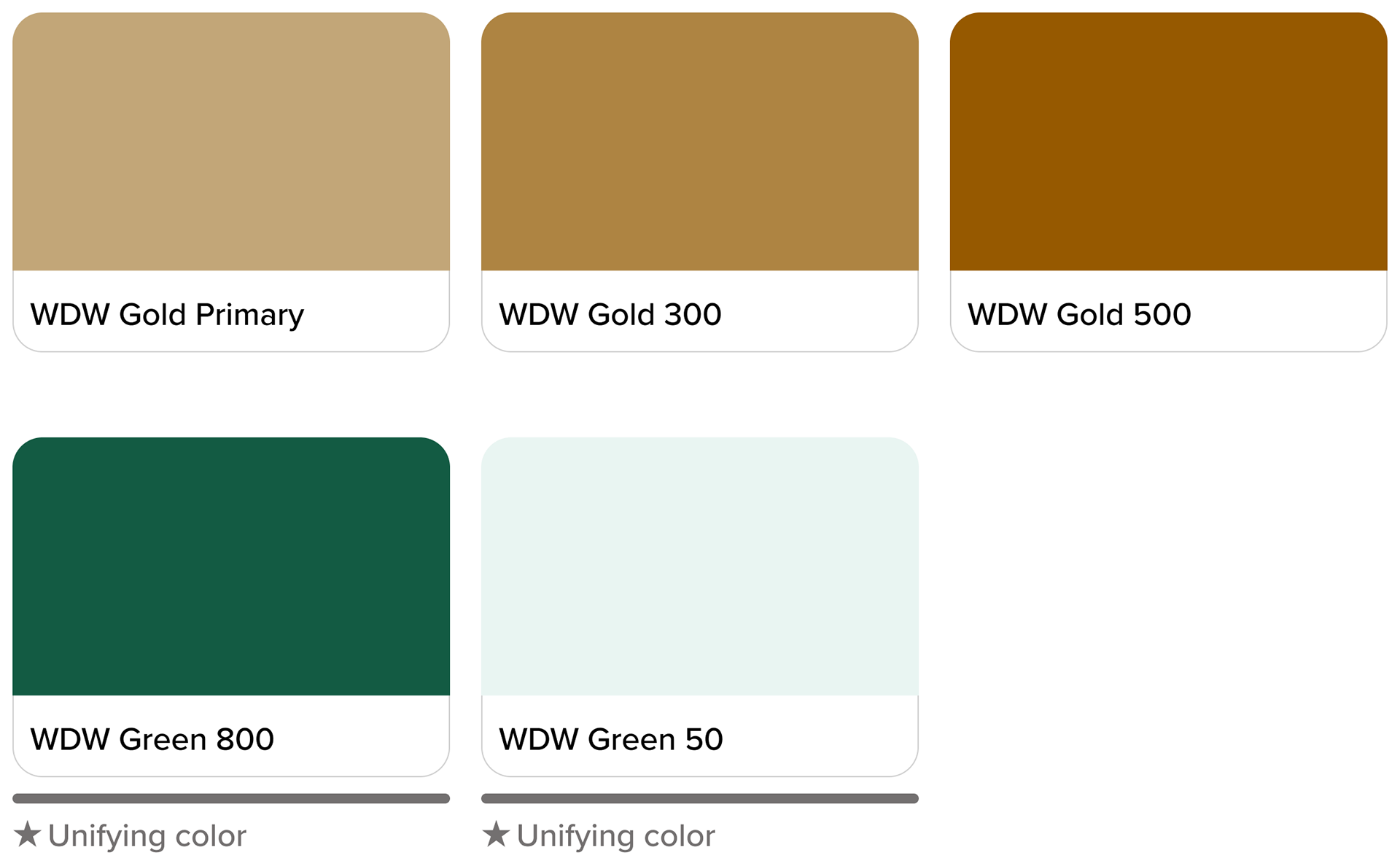
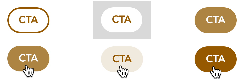
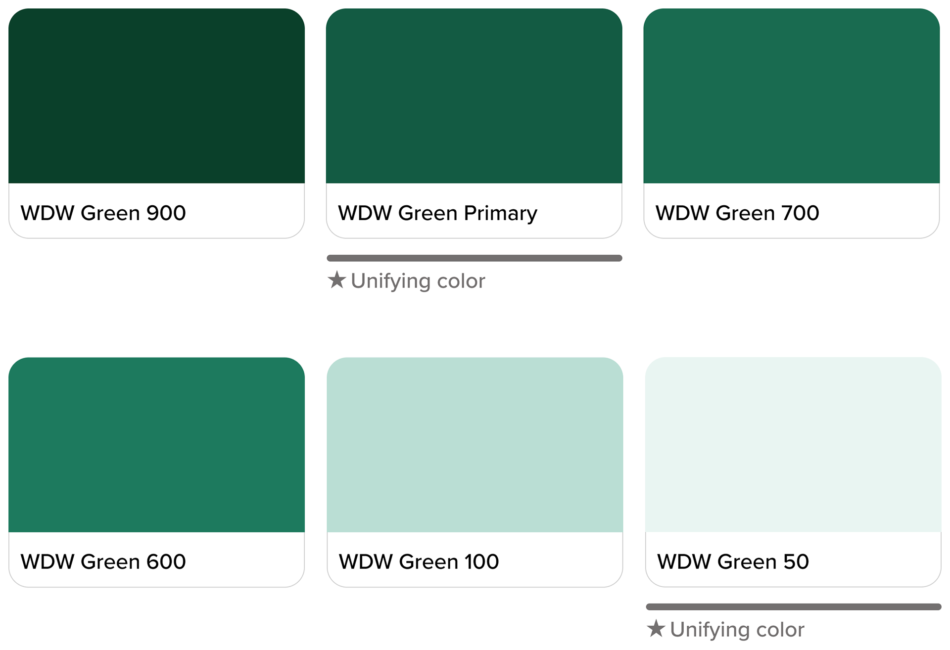
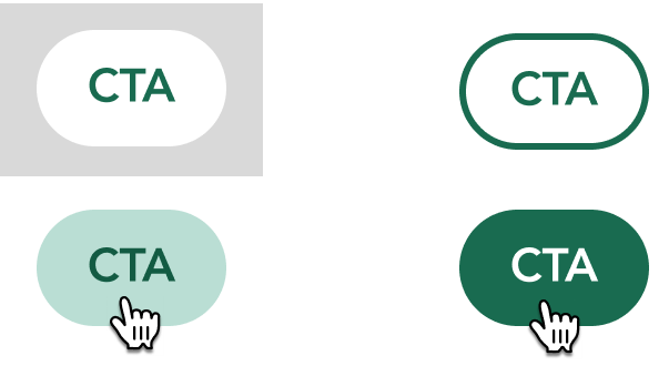
From the core brand colors of the WDW holiday style guide, I chose green as the foundational common color. When I explored its tonal variations I found it to be versatile and accessible. Below are some components with this WDW holiday branding applied.


Maintaining Individuality
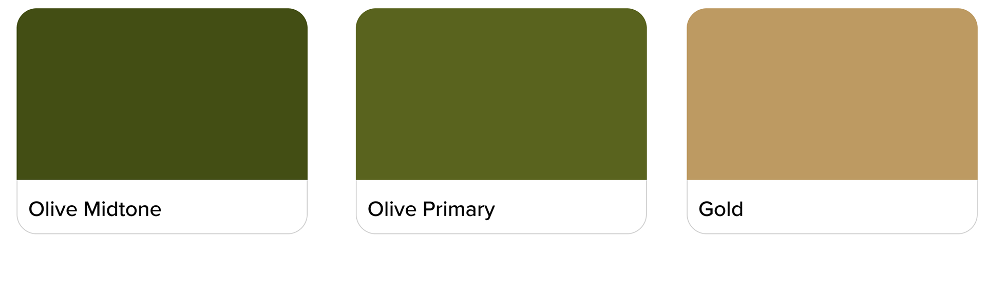
Now that common colors were established, the visual identities for each park and event had to be distinct, on brand, festive, and accessible.
I used a similar strategy of exploring each style guide, adapting and applying color, and identifying design elements. Common colors were incorporated as well for visual unity throughout the product.


Icon Design


Putting it All Together

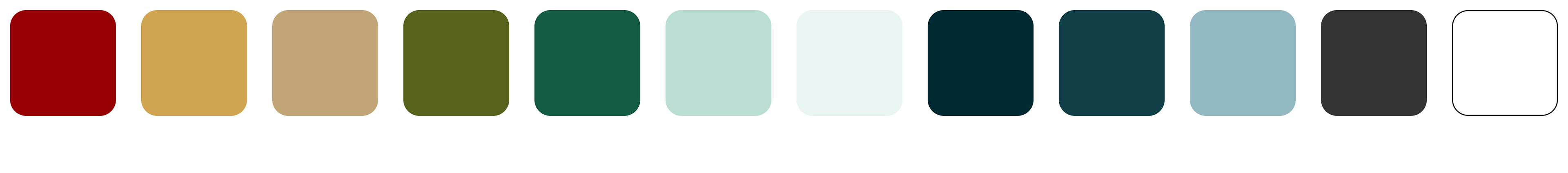
Above is the final color palette of the 2023 in-app digital guide to the holidays at Walt Disney World. Click below for a prototype of the entire product.