
I created a digital style guide and designed a suite of digital products to promote the newly renovated land of Toontown at Disneyland Park, California. Toontown is a beloved space where guests can step into a real life version of Mickey's world.
Project Goals
Create a style guide for guest-facing web pages and app screens that bring to life a playful, cartoon-like world across digital marketing assets.
Problem & Solution
There was very little information available to support Toontown marketing materials, so it was up to me to determine the color scheme, look, and feel of the web pages and app screen.
I referenced Disney's design system and photos and renderings of the space to help with color selection. I also created fun shapes to reflect the organized chaos of the cartoon space.

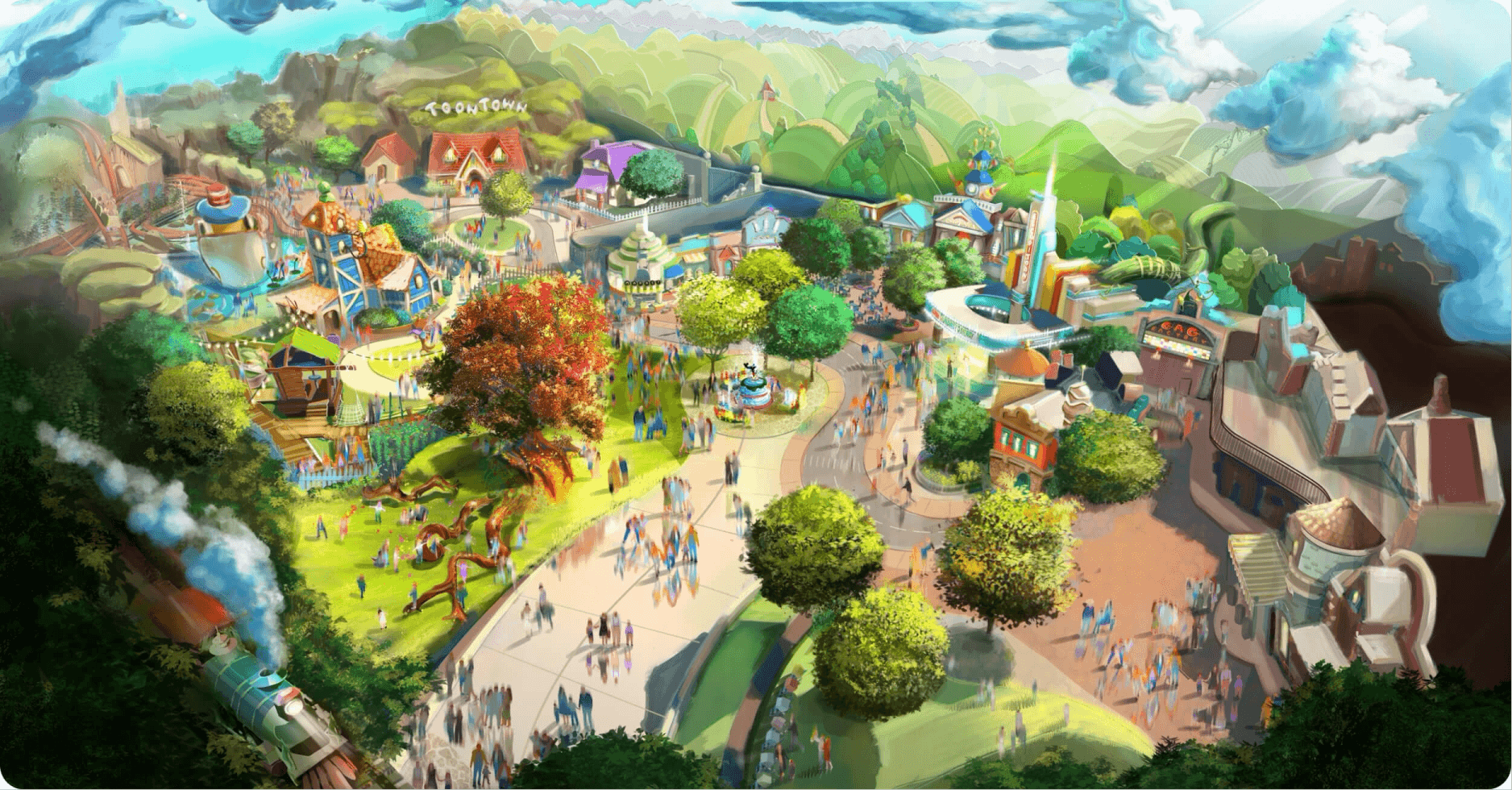
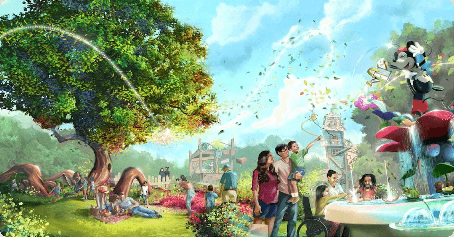
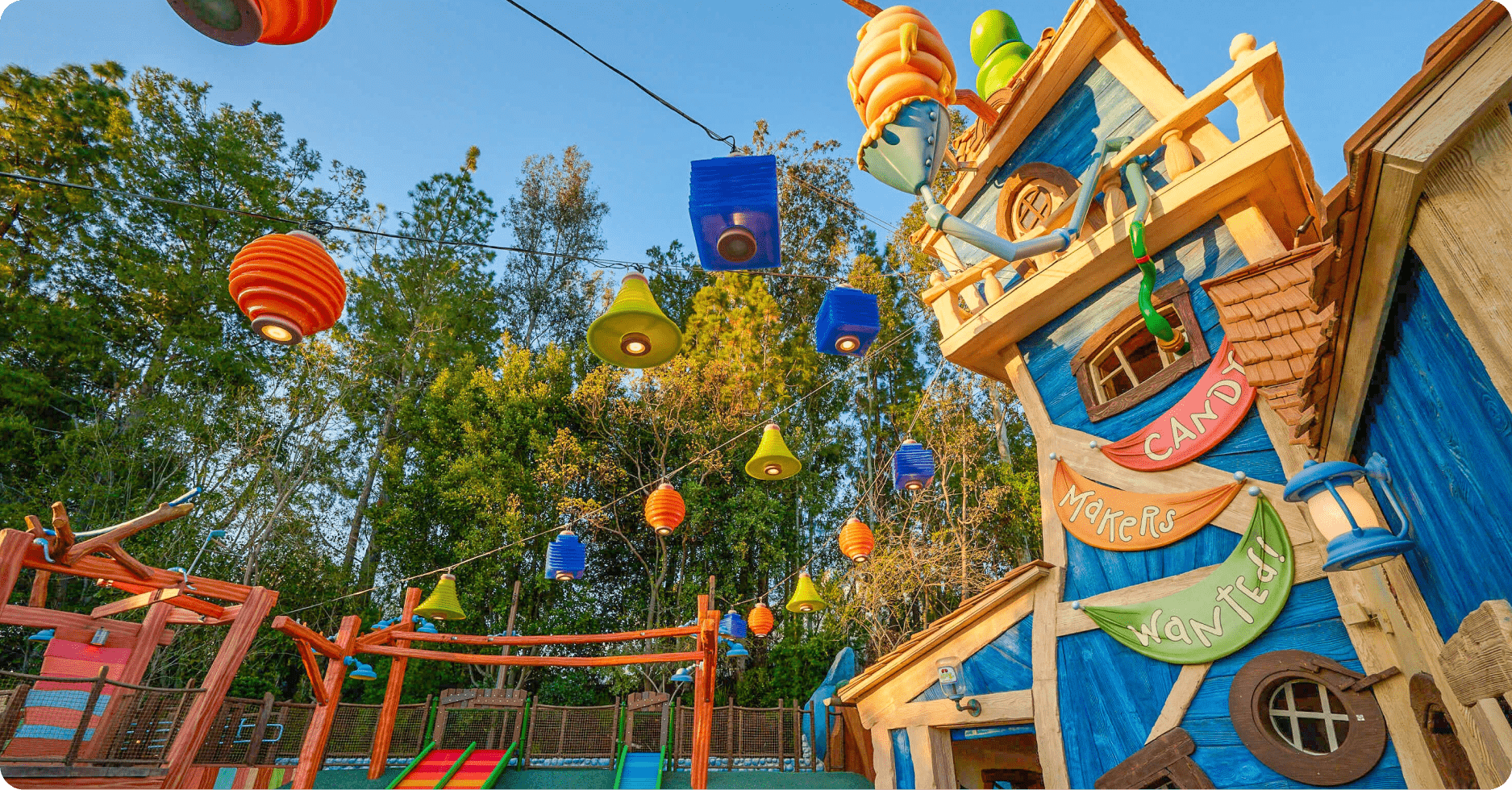
Research & Inspiration
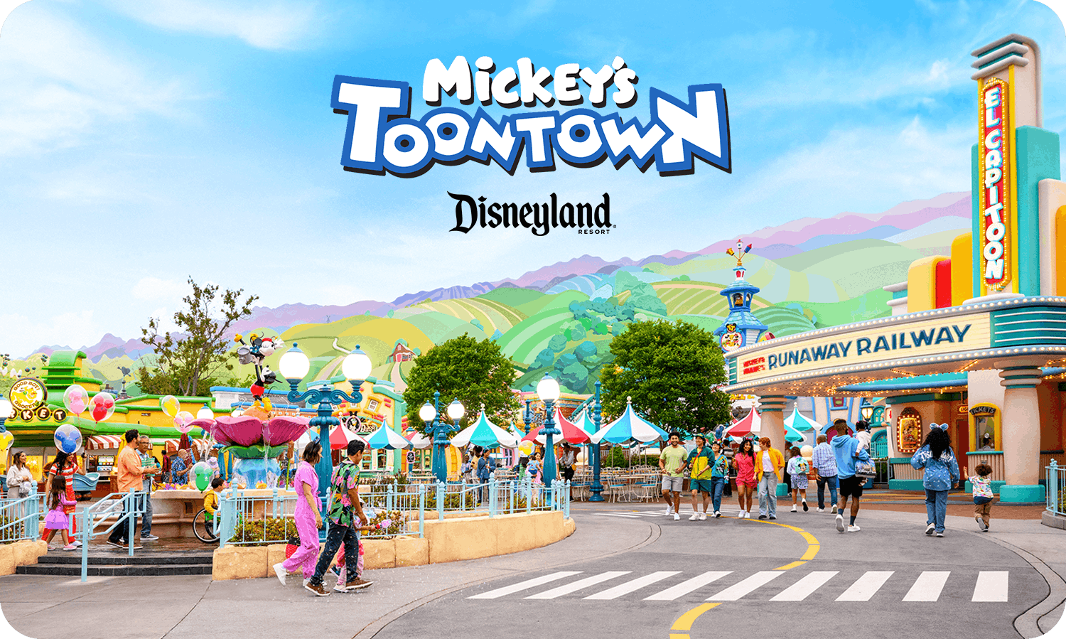
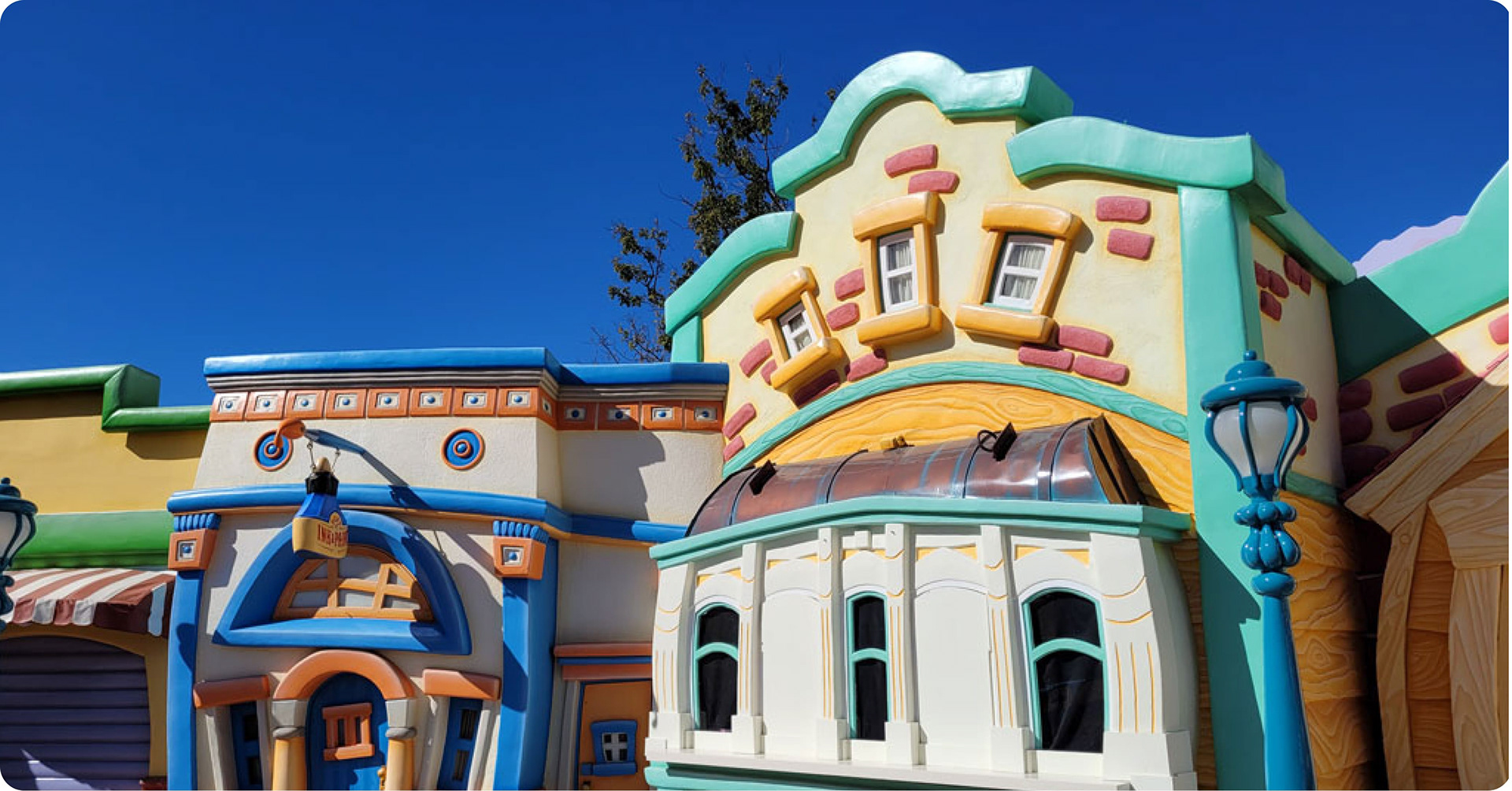
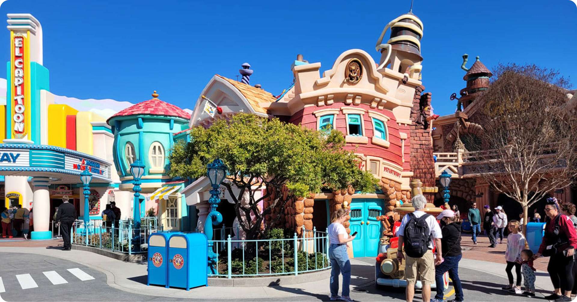
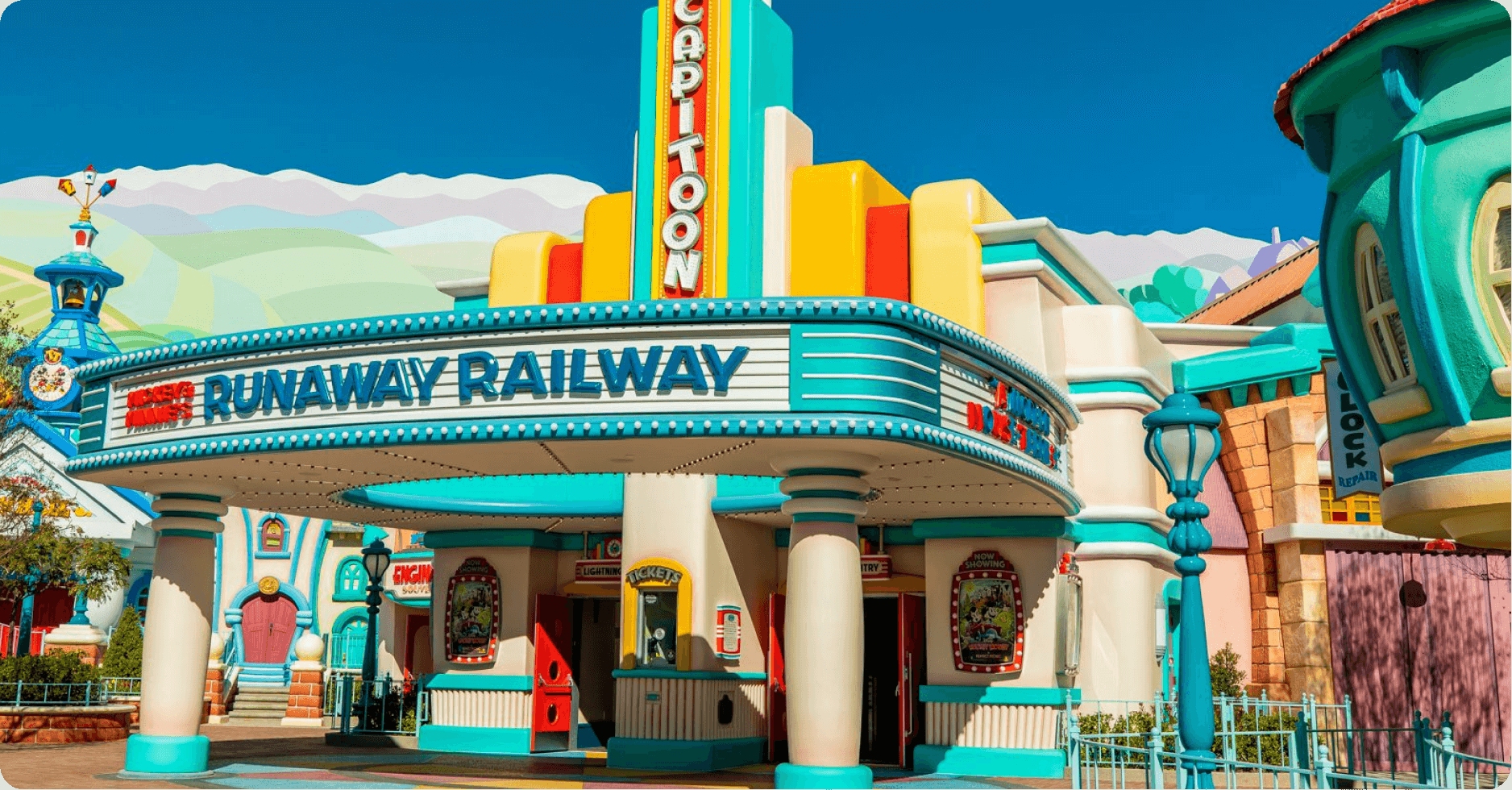
Photographs and renderings helped with early design inspiration, especially with color.

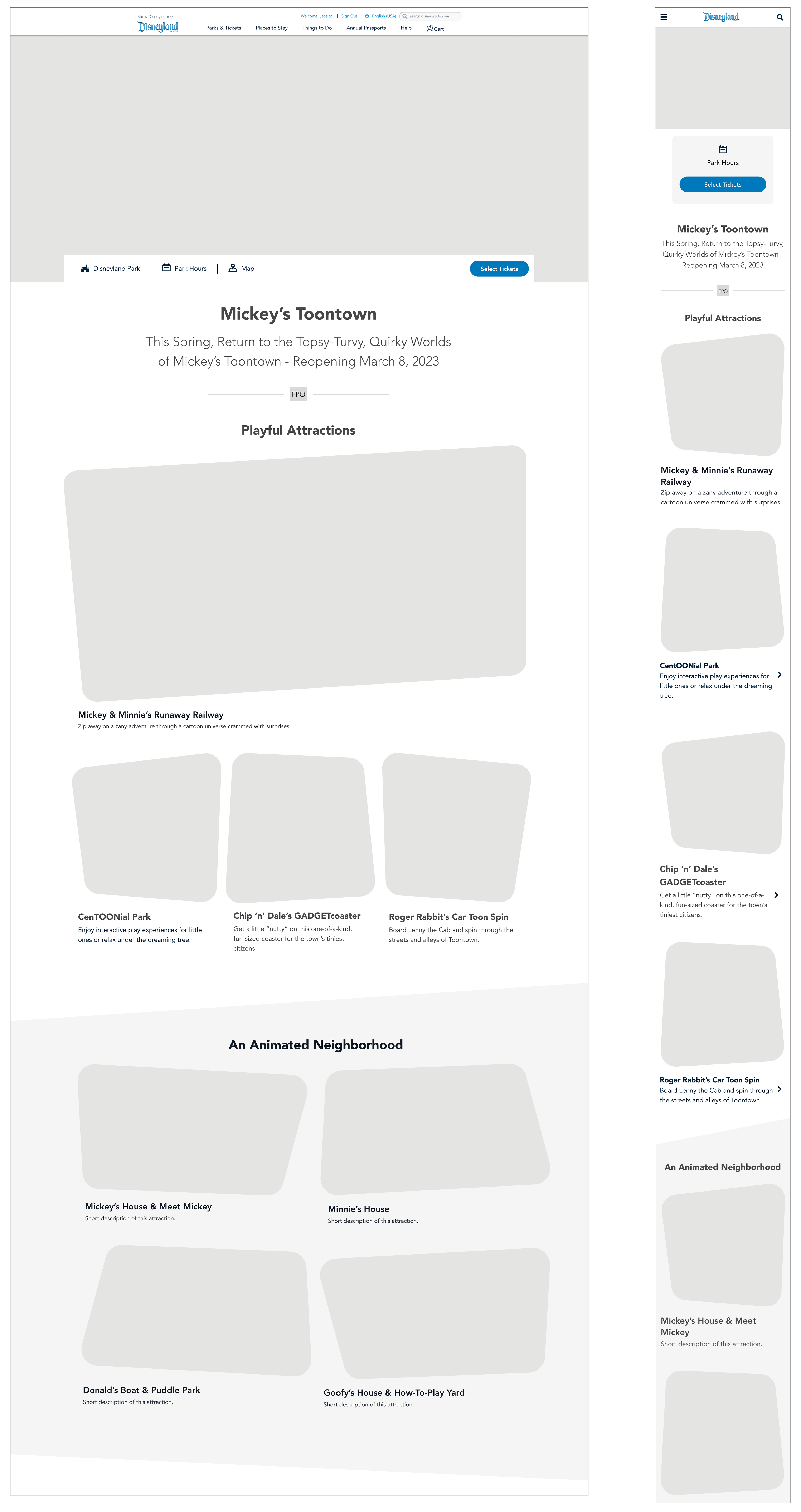
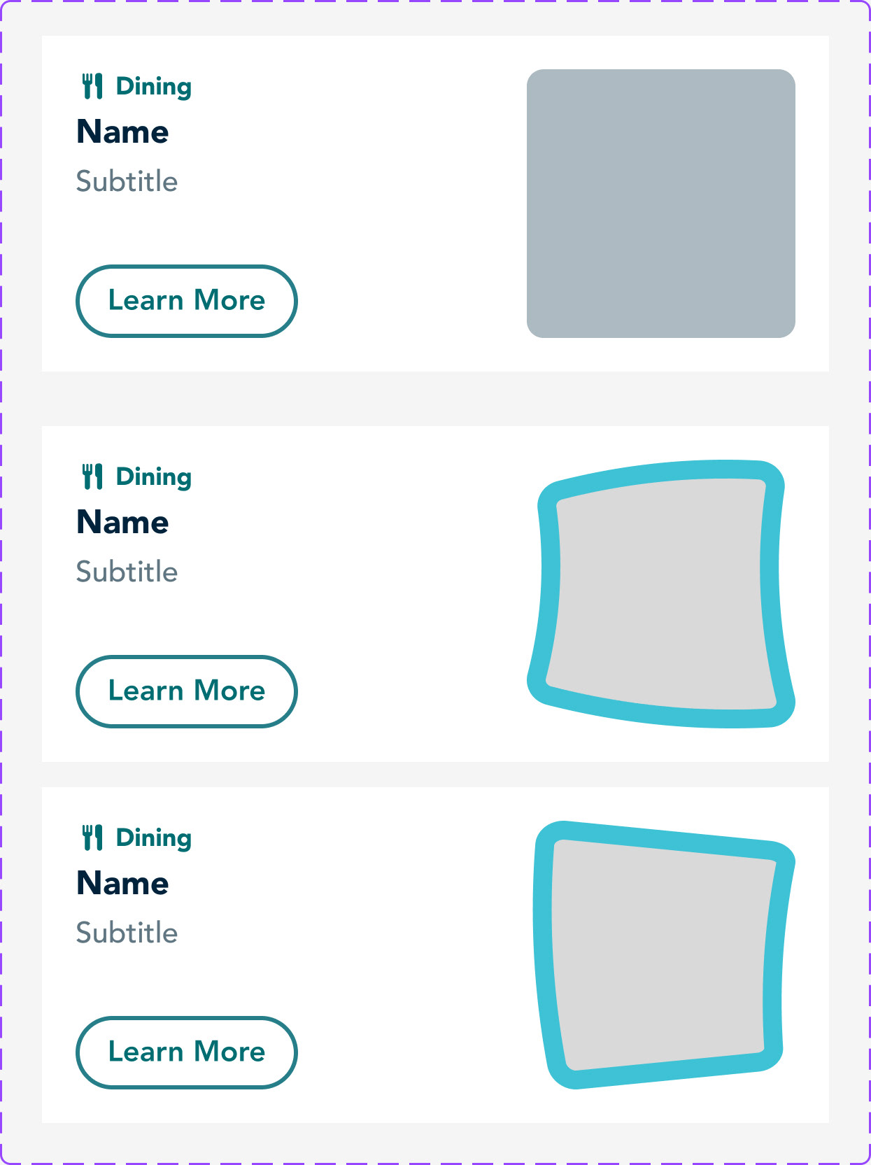
Wireframes
For a cartoon touch I incorporated squashed and stretched shapes and uneven angles into the layout. These were inspired by the land’s architecture.


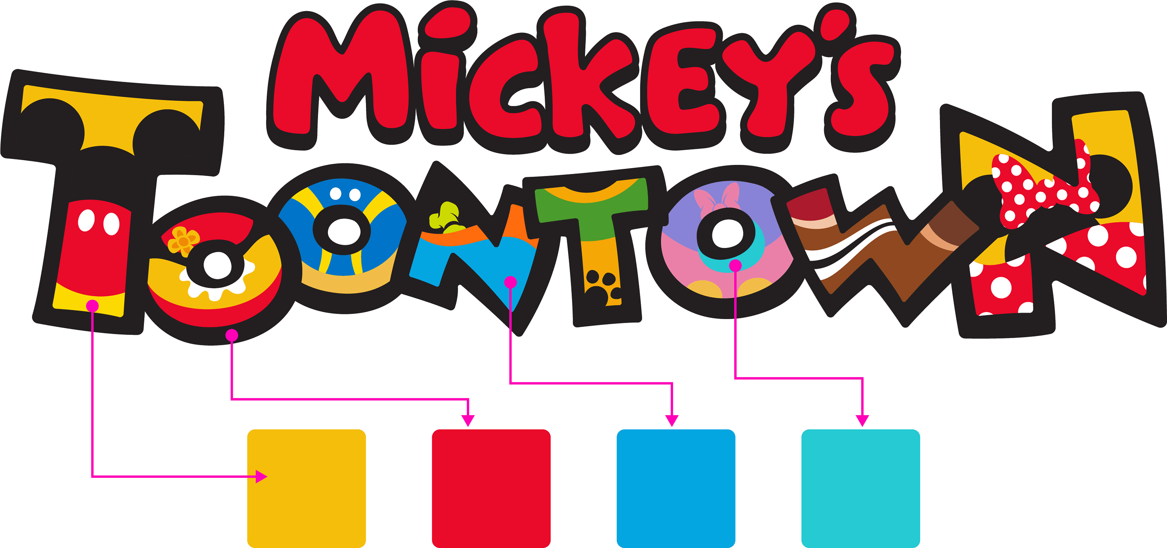
Color Selection
I used the Toontown logo along with the images and renderings shown above when creating a color scheme.
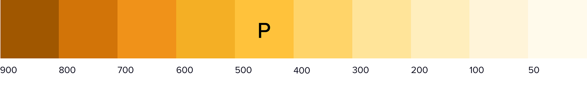
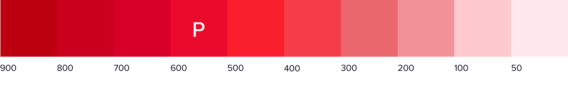
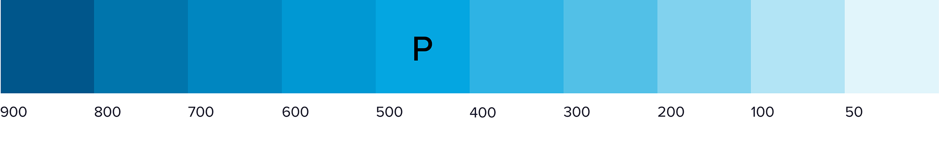
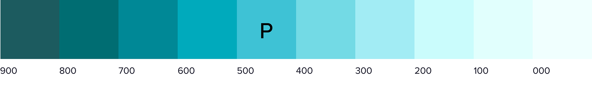

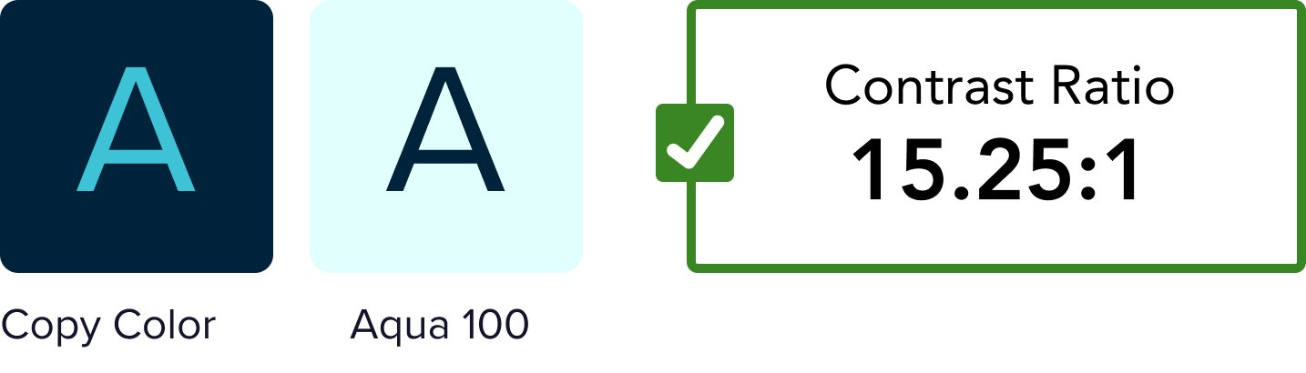
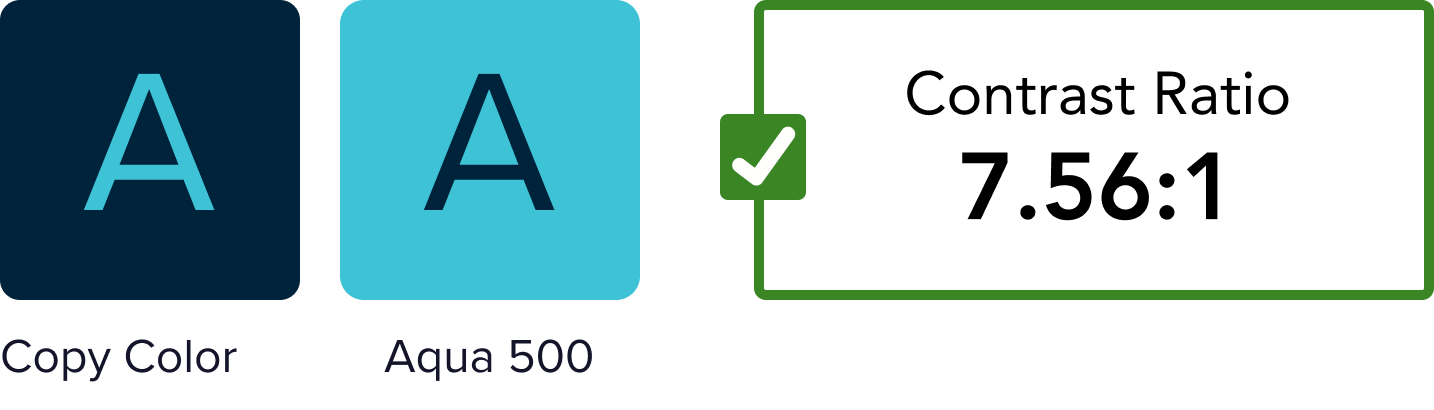
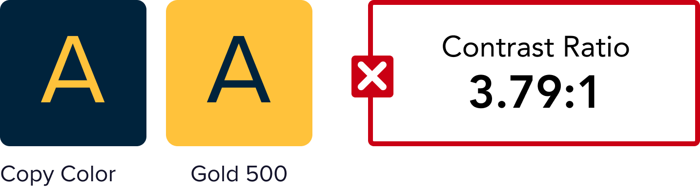
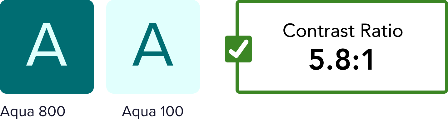
Accessibility Testing

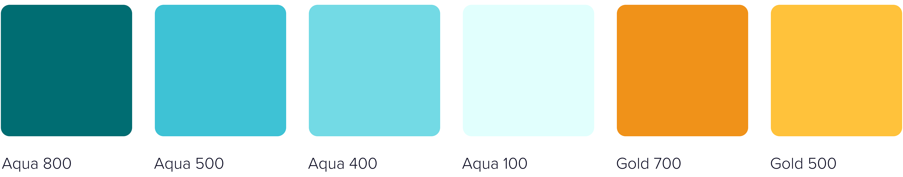
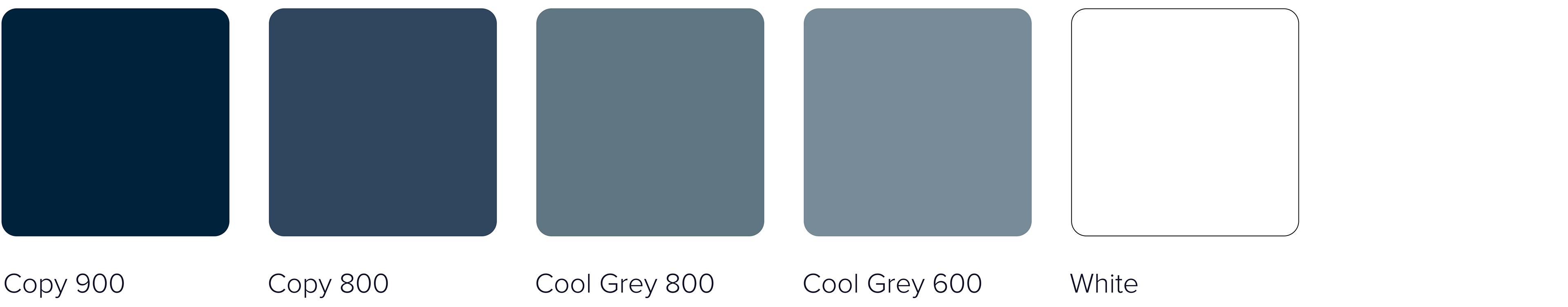
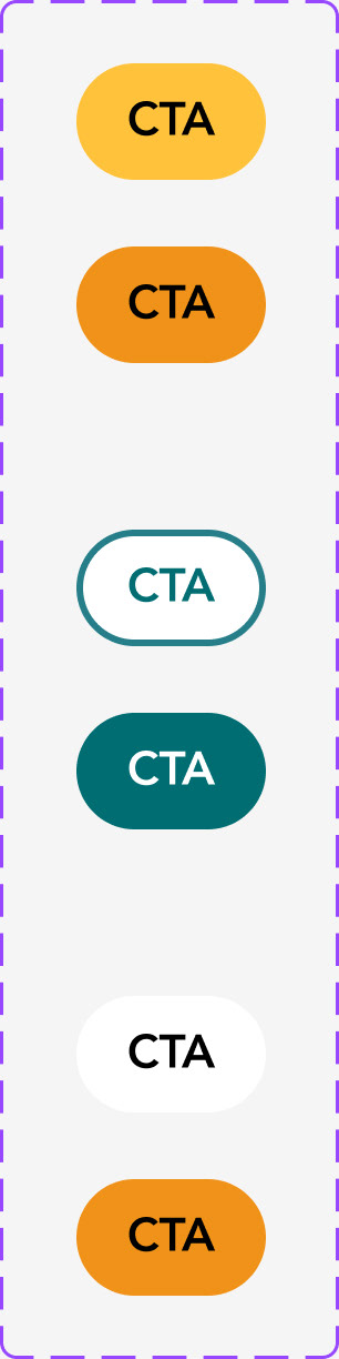
Final Color Palette
Below is the final color palette for web and app as well as a few components with colors applied.
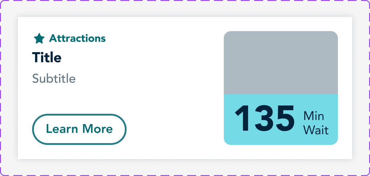


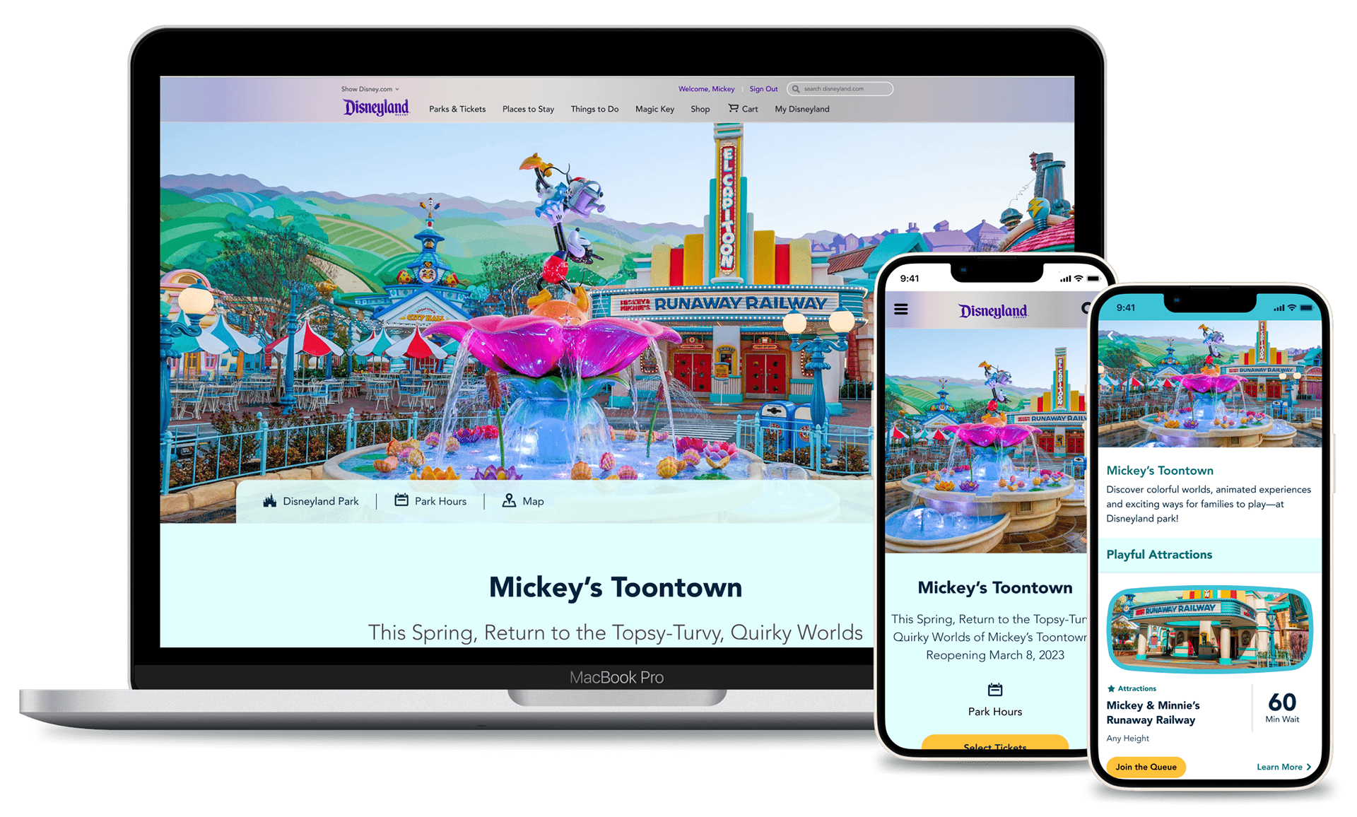
Final Designs
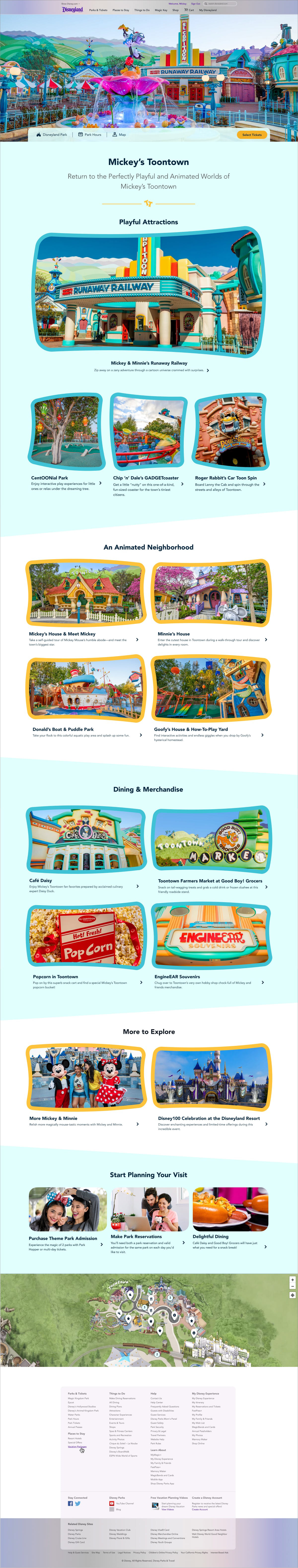
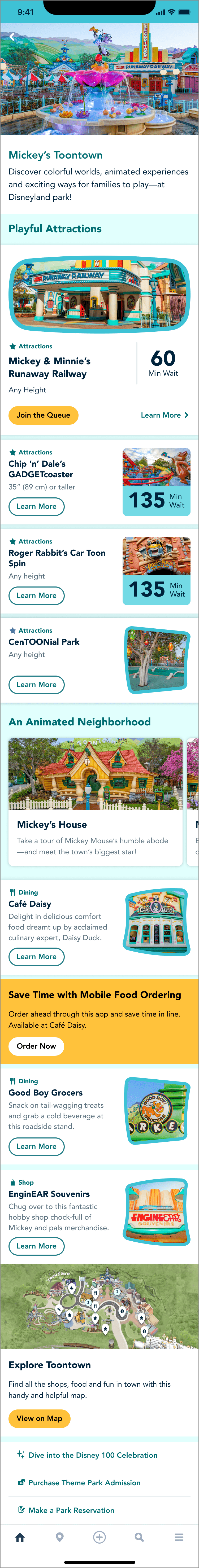
You can view the web pages live on Disneyland’s website. The app screen is currently available within the Disneyland app.